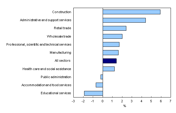
Chart 2
Year-over-year change in average weekly earnings in the 10 largest sectors, October 2012 to October 2013

Chart description
The title of the graph is "Year-over-year change in average weekly earnings in the 10 largest sectors, October 2012 to October 2013."
This is a bar clustered chart.
This is a horizontal bar graph, so categories are on the vertical axis and values on the horizontal axis.
There are in total 11 categories in the vertical axis. The horizontal axis starts at -3 and ends at 7 with ticks every 1 points.
There are 1 series in this graph.
The horizontal axis is "%."
The vertical axis is "sectors."
The title of series 1 is "Year-over-year change in average weekly earnings in the 10 largest sectors."
The minimum value is -1.9 and it corresponds to "Educational services."
The maximum value is 5.9 and it corresponds to "Construction."
| % | |
|---|---|
| Construction | 5.9 |
| Administrative and support services | 4.4 |
| Retail trade | 2.4 |
| Wholesale trade | 2.0 |
| Professional, scientific and technical services | 1.7 |
| Manufacturing | 1.6 |
| All sectors | 1.4 |
| Health care and social assistance | 1.2 |
| Public administration | -0.2 |
| Accommodation and food services | -0.7 |
| Educational services | -1.9 |
- Date modified: