
An image is worth a thousand words: let your dashboard speak for you!

By: Chatana Mandava, Statistics Canada
A dashboard is a visual display of the most important information needed to achieve one or more objectives; information is consolidated and arranged on a single screen so that it can be monitored at a glance. Dashboards play a major role in the data science field as they are one of the most powerful ways to summarize results and communicate them to users. Statistics Canada's analysts often spend their time searching for information from the data provided or deriving insights from the data manually. Presenting a user-friendly and interactive dashboards reduces the workload for analysts as they can get the relevant information just by using filters. Dashboards are a powerful way of representing information that can be used to observe trends and monitor the performance of models to facilitate decision-making within an organization. Presented effectively, dashboards increase the productivity of users by reducing the landscape of information that needs to be parsed. Presented ineffectively, they can make finding the right information a daunting endeavour.
There are multiple tools like Tableau, Power BI, Dash Plotly and Kibana that can be used to build an effective and interactive dashboard. The choice of tool is dependent on multiple factors like type of data (e.g. text, numerical), size of data, parameters and also requirements of users. This article explores examples of two different problem statements and two different dashboards built based on their requirements.
Dashboards using Elasticsearch and Kibana
For a recent project, data scientists at Statistics Canada were tasked with building a dashboard to visualize COVID-19-related news articles and to be able to filter articles based on company name, source name, extraction source name, date, and a few important keywords such as COVID, Personal Protective Equipment, etc. The data extracted to solve this problem were text data. Millions of news articles were extracted through web scraping and various other means. Multiple machine learning and deep learning models such as SVM (Support vector Machines) and BERT (Bidirectional encoder representation from transformers) were applied to classify the news articles. The optimal way to display the consolidated results was to build an interactive dashboard. For this project, a Kibana dashboard was built to display all the news articles and visual representations of the output.
Elasticsearch is a search engine based on the Lucene Library. Elasticsearch allows the storage of huge volumes of data, and allows users to search through the data quickly and display the results in milliseconds. Instead of searching the text directly, it searches through an index and delivers results within a short amount of time. Kibana is a visualization and management tool for Elasticsearch. Given the objective of the project, Kibana was chosen as the appropriate tool. There are many interesting features in Kibana that allow users to build histograms, pie charts, bar charts, maps and so forth. The interactivity is automatically handled in Kibana. There are many other visualization tools (like Vega or Timelion) which can help create aggregate-based visualizations. Another interesting feature in Kibana is the ability to customize visualizations. The new Vega component allows users to create a variety of data visualizations available from the Vega library. The data can be ingested into Elasticsearch with the help of a Python library. The main objective of using the Elasticsearch Python library is to access news articles and store them in Elasticsearch for searching and analytics purpose. The data are scraped and ingested into Elasticsearch by creating a strict schema or mapping to make sure the data are being indexed in the correct format and type. Querying can be performed once the record is indexed.
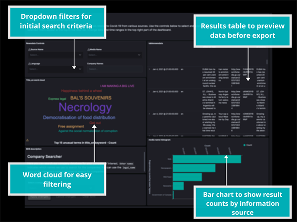
Description - Figure 1
An example Kibana dashboard with multiple filters for analysts to quickly find items of interest.The inbuilt options in Kibana Dashboard were utilized to build an interactive dashboard from the news articles. Over a period of approximately 10 days, a time series chart was built to analyze the total number of articles that were extracted during the period of time. This is an interactive time series plot that allows users to click on any year and the articles are filtered accordingly. The table option was used to visualize the title, body, snippet, extraction source, company name, source name and media name of the news articles. All the required filtrations were included in the dashboard, along with some aggregation visualizations. A few other features, such as word clouds, were also included which helped the analysts to understand the important words in those news articles and filter the required articles based on those words. These words change when filters are applied and new sets of words appear as per the sub-selected articles. One of the features allows users to save the results in a CSV file in case the analyst needs to incorporate other tools for further analysis. Users can also share the dashboard with others by sending them a URL.
The index patterns feature in Kibana helps to modify the index patterns and to update the index pattern field accordingly. An index pattern allows you to define properties of the field. For example, when the data are ingested into the database few fields will become searchable and some fields will be aggregable. The index pattern allows users to enable these features for all the fields. In the above problem case there is a field which contains the URL of the articles. When ingested this URL field format changed to Text. The format was modified to a clickable URL with the help of an index pattern.
Dash Plotly
In another example of the uses of dashboards, a second project at Statistics Canada set out to detect events from news articles. Working with users over a 35 day period, the final results were displayed in a dashboard built using Dash Plotly. Dash is an open source tool developed by Plotly for building machine learning and data science web apps. It allows users to insert various widgets, choosing dispositions and style as Dash's layout is HTML-based.
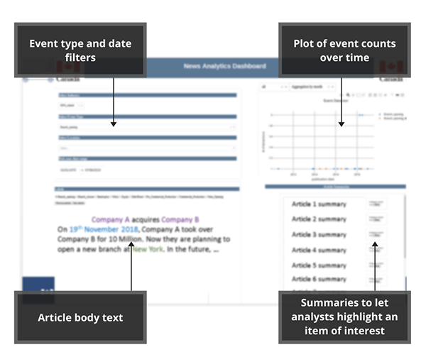
Description - Figure 2
An example dashboard created using Dash Plotly. This example shows events found in news articles.This dashboard also included a table that displays news articles, a summary of other articles, interactive buttons to move to next and previous article, a time series graph and a drop-down menu to filter articles based on company name, date, and division. Dash doesn't include the same number of inbuilt features as Kibana. It is meant to provide a lower level of functionality for building custom web applications. Through Dash Plotly, users can highlight the location, organization, date and time in the news articles. The entire script for the dashboard is written in Python, meaning special consideration needs to be given if it is to be shared outside your organization.
Pick the approach based on end-user needs
While this article examined dashboards built using Kibana and Dash Plotly, there are many other interactive dashboards that can be built using various tools. Both of the projects discussed leveraged cloud-based systems, but desktop tools also exist that can be connected to systems with less demanding requirements. Both Kibana and Plotly provide flexible systems, but they integrate into workflows in different ways. Elasticsearch is heavily focused on high performance text indexing and searching, making it a good choice for interaction with large amounts of text data. Dash Plotly incorporates all the power and convenience of Pandas for manipulating the data. Which tool you choose to use depends heavily on the context and requirements of the project and the needs of the end-users.
- Date modified: