Infographic 1
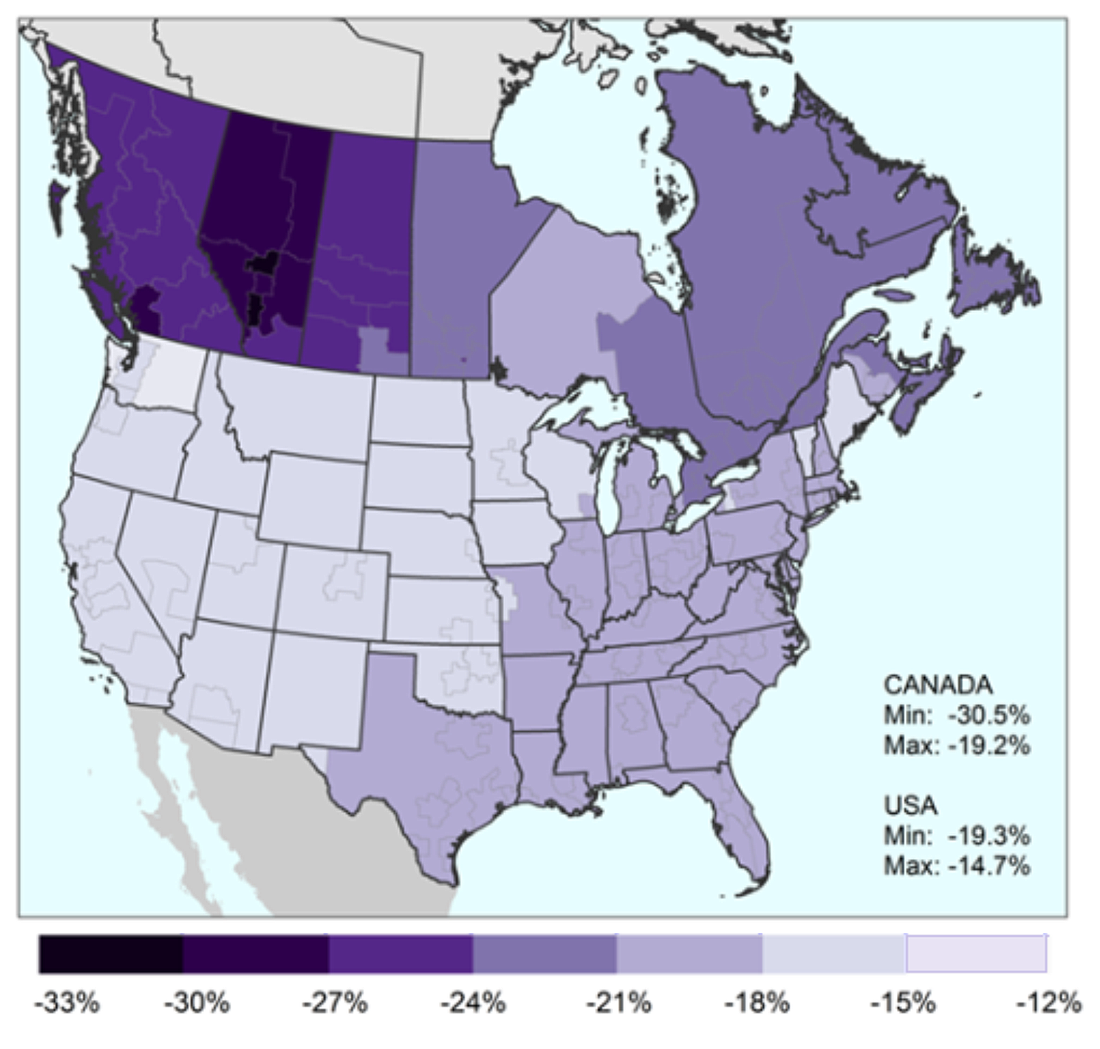
Fall in Canada–United States trade resulting from an increase in border costs, by region

Infographic description
The title of the infographic is "Fall in Canada–United States trade resulting from an increase in border costs, by region"
The title of the map is "Fall in Canada-US trade by region resulting from an increase in border costs."
This is a map of Canadian provinces (the territories are not included) and the continental United States. The inter-provincial, intra-provincial, inter-state and intra-state borders are depicted in the map. Below the map is a bar chart and associated horizontal colour bar located under and along the x-axis of the bar chart. The colour bars have seven shades of colour. At every change in shade there is a vertical line that starts at the top of the colour bar and extends over the bar chart.
The map legend shows the minimum response in the growth in trade for Canada, which is -30.5%, and the maximum response of -19.2%. The corresponding minimum and maximum responses in the growth of exports from U.S. regions to Canada are -19.3% and -14.7%, respectively. These are shown in the map legend below the percentages for exports from Canadian regions. The significance of the colours shown in the map is given by the bar chart and associated colour bar.
The graduation of the y-axis in the bar chart associated with the map begins at 0 and ends at 15, with tick marks at every 5 units. The x-axis shows the 0 mark at which it begins. The graduation used for the x-axis is the graduation of the colour bar, which consists of shades of purple. The colour bar and its graduation extend further to the right and to the left of the x-axis. The graduation starts at -33% (at the beginning of the darkest shade) and ends at -12% (at the end of the lightest shade), with changes in colour at every 3 units. The x-axis starts close to the end of the darkest shade and ends close to the beginning of the lightest shade. There are seven shades of blue in the colour bar. In the bar chart, the bars with the highest values (one bar has a value of more than -15) are located close to the -18% unit in the colour bar.
The colours in the map run from dark purple for the biggest decreases in international trade, to light purple for the smallest ones. Canada is more darkly shaded than the United States. The three western provinces, and especially Alberta, are darker than the rest of Canada (reduction in trade between 33% and 21%). Western Ontario is the most lightly shaded (reduction in trade between 21% and 18%). In the United States, the eastern seaboard and southeast from Florida to Texas are similar in colour to western Ontario. The west and Midwest are lighter purple than the rest of the map (reduction in trade between 18% and 12%).
The note and sources for the map are as follows:
Note: Presented is the percentage change in exports from Canadian economic regions to U.S. metropolitan areas or non-metropolitan areas, and in exports from U.S. metropolitan areas or non-metropolitan areas to Canadian economic regions, based on a scenario of increasing border costs.
Sources: Statistics Canada, Surface Transportation file; and United States Census Bureau, Commodity Flow Survey.
- Date modified: