
A new way to track the job market!

Statistics Canada's monthly figures on employment, unemployment and the labour force participation rate—three essential Labour Market Indicators (LMIs)—are among its most sought-after data.
The media, labour market analysts, economists, consultants, planners, forecasters and academics in both the private and public sectors look forward to seeing the latest numbers on the first Friday of each month.
Private‑sector organizations use these figures to track trends in the economy, while different levels of government use them to evaluate and plan employment programs in Canada.
Many users access labour data using the LMI Desktop Application. And this month, they will notice an improvement.
What's new?
The old LMI Desktop Application has been replaced by a new web-based dashboard that makes it easier than ever to track the ups and downs of the job market in communities across the country.
So what exactly has changed?
The new dashboard features an updated, user-friendly interface that is both interactive and customizable. Users can view key LMIs on a map and a chart showing labour force characteristics at the national, provincial or census metropolitan area level.
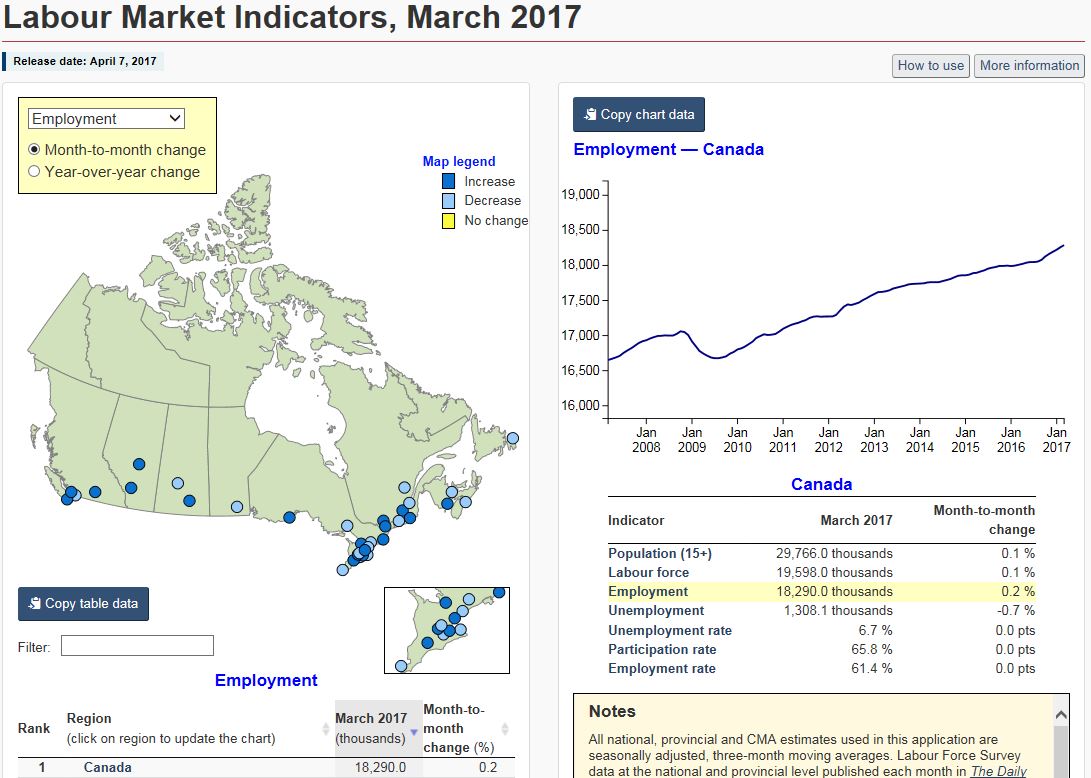
Visually, the new application offers a broader picture of these indicators. Instead of navigating back and forth, users can simultaneously view the map, the chart, the tables and the key indicators within one screen, and click a specific geographic location to update all LMIs. In addition, the data are right there in the application, meaning that users no longer have to extract data from CANSIM and chart those data themselves.
The new dashboard is part of StatCan's ongoing efforts to make data more accessible. Data visualization takes complex datasets and makes them usable and understandable. As Belia Velho, from the Communications and Dissemination Branch, explains, “It's an interactive tool that will allow every average user to quickly understand the data.”
Looking ahead
While the dashboard currently contains only Labour Force Survey data, keep an eye out for significant updates later this year, when LMI data from other surveys will be added to the application. The goal is to respond to user requests by including key indicators from different surveys and developing new indicators that are not necessarily available on CANSIM.
Statistics Canada is increasingly focused on finding more dynamic and interactive ways to present data visually, and the new LMI dashboard is just the beginning. To better support the needs of users, the agency will be releasing several data visualization products over the next year, including thematic maps, a 2016 Census data viewer, a population clock and chord diagrams. Stay tuned!
Check it out
Test drive the new LMI dashboard and let us know what you think!
Login/register to post comments.
Recent posts
-
 1904 people recommended this
 -
 2551 people recommended this
 -
 2925 people recommended this