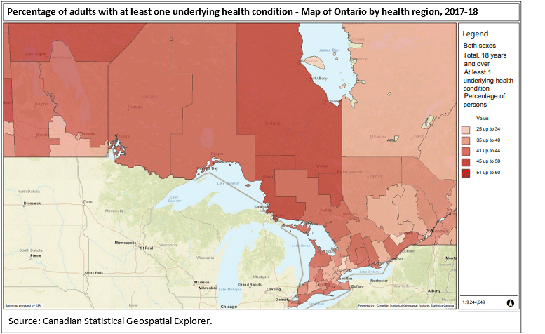
Map 1
Percentage of adults with at least one underlying health condition - Map of Ontario by health region, 2017-18

Map description
The title of the map is "Percentage of adults with at least one underlying health condition - Map of Ontario by health region, 2017-18"
This is a map showing the percentage of people aged 18 years and over who reported having at least one underlying health condition in 2017-2018 by health region for Ontario.
Health regions are outlined with a thin black line.
The legend shows a range of colours for percentage values:
25 up to 34 in light red
35 up to 40 in medium light red
41 up to 44 in medium red
45 up to 50 in medium dark red
51 up to 60 in dark red
Source: Canadian Statistical Geospatial Explorer.
- Date modified: