
Creating Compelling Data Visualizations
By: Alden Chen, Statistics Canada
Introduction
Data visualization is a key component in many data science projects. For some stakeholders, especially subject matter experts and executives who may not be technical experts, it is the primary avenue by which they see, understand and interact with data projects. Consequently, it is important that visualizations communicate insights as clearly as possible. But too often, visualizations are hindered by some common flaws that make them difficult to interpret, or worse yet, are misleading. This article will review three common visualization pitfalls that both data communicators and data consumers should understand, as well as some practical suggestions for getting around them.
Distortion and perception
The most important quality of an effective visualization is that it accurately represents the underlying data. Distortion occurs when the data being presented are not perceived accurately. The degree of distortion in the visualization is directly related to how readily the information presented is perceived. When designing visualizations, it's important to remember that different visual encodings are perceived differently, which can lead to distorted, misinterpreted results.
In 1957, psychophysicist Stanley Smith Stevens' On the psychophysical law showed an empirical, generally nonlinear relationship between the physical and perceived magnitude of some stimulus. He derived a relationship of the form , where represents the physical intensity of the stimulus and represents the perceived sensation (Stevens, 1957). The most important variable here is , the exponent that relates perception of the stimulus to the actual physical magnitude of the stimulus ( is a proportionality constant to adjust for units.) Our perception varies depending on how the data are encoded. When experiencing an encoding with less than one, the magnitude of the stimulus tends to be underestimated. When experiencing an encoding with greater than one, the magnitude of the stimulus tends to be overestimated.
Figure 1: Stevens' Power Law
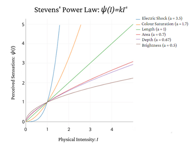
Description - Figure 1
A plot illustrating Stevens' Power Law (1957). The graph shows how six different encodings are perceived with physical intensity along the x-axis and perceived sensation along the y-axis. The varying shapes of the curves illustrate how different encodings are perceived. Length is the most accurate encoding and is plotted along the 45 degree line. Curves representing electric shock and colour saturation, encodings that tend to exaggerate effects in the data, sit mostly above the 45 degree line. The remaining three encodings shown—area, depth and brightness—tend to understate the true effect and appear below the 45 degree line.
Today, this relationship is known as Stevens' Power Law, which is one of the best-known results from psychophysics and important to understand for data visualization. Figure 1 demonstrates some of the visual encodings that Stevens tested, as well as electric shock for reference. Some encodings, such as colour saturation, lead to overestimating the effect, while other encodings, such as area, lead to underestimating the true effect. When using these encodings to represent data, the inability to perceive the true data or effect leads to distortion. Notice that while the ability to perceive most encodings is nonlinear, the ability to perceive length is linear.
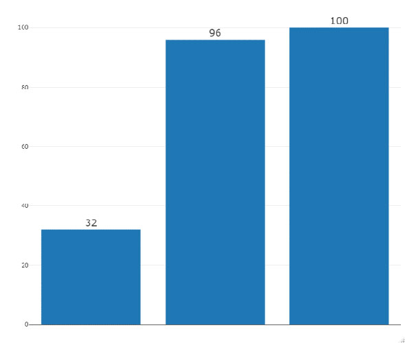
Consider the following example, which encodes the same data using area and length. Notice that it is much more difficult to discern how much greater 96 is compared to 32 when looking at the circles in Figure 2 than it is when looking at the bar chart in Figure 3. Moreover, it is almost indiscernible that the area of the 100 circle is larger than the area the 96 circle, whereas it is clear that 100 is greater than 96 when looking at the length of the bars. The difference between 100 and 96 is distorted when encoding the information using area.
Figure 2: Circle Graph
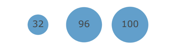
Description - Figure 2
An example of a graph showing three circles. A small circle with the number 32, a larger circle with the number 96 and a slightly larger circle with the number 100.
Figure 3: Bar Graph
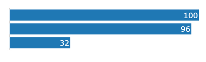
Description - Figure 3
An example of a graph showing three bars that decrease in length: 100, 96 and 32.
Two graphs encoding the same data. The first graph uses the area of each circle to encode the data, whereas the second graph uses the length of each bar. Two of the circles are almost indiscernible in area, while it is clear that the two corresponding bars are of different length.
Data visualizations often use encodings that distort data, such as heatmaps (colour saturation, ) and pie charts (area, ). It's important to recognize distortion and to review the actual numbers underlying the visualization before rushing to judgements. When making visualizations and choosing visual encodings, some understanding of visual perception theory helps. It's often the simplest visuals that are the most effective. Consider the ranking of visual encodings in Table 1 as a starting point (Mackinlay, 1986). Mackinlay made recommendations about encodings for different types of data: quantitative, ordinal and nominal data. The effectiveness of encodings depends on the type of data. For example, colour is not an effective encoding for quantitative data; however, for nominal data it is highly effective. It's a good idea to encode the most important information using the most effective, least distorted encoding.
Table 1: Mackinlay's ranking of visual encodings for different types of data, ranked from most to least effective.
| Quantitative | Ordinal | Nominal |
|---|---|---|
| Position | Position | Position |
| Length | Density | Colour Hue |
| Angle | Colour Saturation | Texture |
| Slope | Colour Hue | Connection |
| Area | Texture | Containment |
| Volume | Connection | Density |
| Density | Containment | Colour Saturation |
| Colour Saturation | Length | Shape |
| Colour Hue | Angle | Length |
| Texture | Slope | Angle |
| Connection | Area | Slope |
| Containment | Volume | Area |
| Shape | Shape | Volume |
Occlusion and overplotting
Occlusion in data visualization occurs when two data points overlap, either partly or completely. For example, two points could be directly on top of each other, making it unclear to the reader that there are actually multiple data points. As a result, it becomes difficult to see the full scope of the data being presented and the effect of the occluded points cannot be seen.
Overplotting, that is displaying too much data, is a common cause of occlusion. This can occur in an effort to display as much data as possible in an attempt to give viewers a full picture. Consider figures 4 to 7, which demonstrate occlusion caused by overplotting and present some potential solutions. Each of these plots visualizes the same set of 10,000 points. In Figure 4, the distribution of the points cannot really be seen because of occlusion. There are so many points overlapped that all you can see is a large mass of points spanning almost the entire bottom left quadrant of the graph. The subsequent plots show some possible options to help reduce occlusion.
The points in Figure 5 are slightly smaller and more transparent. By adjusting the transparency (often denoted ) viewers are better able to see the distribution and the occluded points, though there are still many points that are occluded near the origin.
In Figure 6, there are no points shown at all. Instead, there is a contour plot showing the distribution of points, where the points are highly concentrated around a small region near the origin. Often when dealing with large datasets, such as those generated by simulations, the specific points are not particularly of interest; rather, it is the general pattern that is important, which is captured clearly by the contour plot.
Figure 4: Scatterplot 1
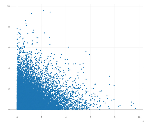
Description - Figure 4
An example of a scatterplot of 10,000 points with a large mass of points in the bottom left quadrant of the graph. Many points are overlapping with one another, making it difficult to see the distribution.
Figure 5: Scatterplot 2
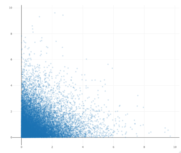
Description - Figure 5
An example of a scatterplot of the same 10,000 points with smaller and more transparent points to reduce occlusion. There is still a mass of points in the bottom left quadrant, but it is clearer that the points are more concentrated around the origin.
Figure 6: Contour plot
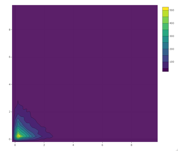
Description - Figure 6
An example of a contour plot showing that many data points are concentrated near the origin, in the bottom left quadrant.
Figure 7: 3-D histogram
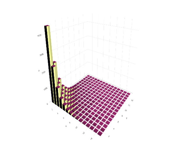
Description - Figure 7
An example of a 3-D histogram of the same set of points. Taller bars near the origin show the distribution somewhat more clearly; however, the taller bars occlude the shorter bars.
Figure 7 shows a three-dimensional histogram. Creators of visualizations who want to display a lot of data may be tempted to add another axis to create a 3D visualization; however, 3D graphics rarely make the visualization clearer because they cause occlusion themselves. In Figure 7, the three-dimensional nature of the plot means that the taller bars are occluding the shorter bars and the bars in front are occluding the bars in the back. So while the use of 3D may reduce overplotting, it still doesn't solve the occlusion problem and viewers still cannot see the full scope of the data. 3D graphics almost always result in occlusion, and occlusion management in 3D visualization is a somewhat active area of research in computer graphics. (See Trapp et al., 2019; Wang et al., 2019).
In summary, while it is generally a good idea to show readers the actual data, overplotting is counterproductive. The occlusion caused by overplotting can sometimes hide the main trend in the data. Adjusting certain visual components such as the size and transparency of the marks can help, but it's also important to consider if plotting all the individual data points is necessary for the analysis being presented.
Redundancy and clutter
To better delineate differences in the data, you may choose to encode some values redundantly using multiple features; this practice is called redundant encoding. For example, you may choose to distinguish between two classes using both colour and shape, say orange triangles and blue squares, in a scatterplot. Redundant encodings are widely used and thought to improve the clarity of visualizations. In fact, several software packages use redundant encodings as the default for certain visuals; however, empirical support for this practice is mixed (Nothelfer et al., 2017; Chun, 2017).
It is important to remember that redundant encodings do carry some costs, namely clutter, and do not always help. Consider figures 8 and 9. Figure 8 presents a bar chart with the same information (32, 96, 100) encoded four different ways. The labels along the x-axis (Low, Medium, High), already encode the data, albeit crudely. Then there's the length of the bars themselves, which are also accompanied by text labels that explicitly show the value. And lastly, there's a discretized colour scale where the colour of the bars also represents the value. There are four distinct visual cues that all encode the same information. This bar chart is a very low-noise environment; it's a simple graph with only three bars. In low-noise environments redundancy usually amounts to clutter. Compare to Figure 9, which loses the discretized colour encoding. It could be argued that the visualization is made more effective by removing an unnecessary encoding that may have distracted readers from the actual data.
Figure 8
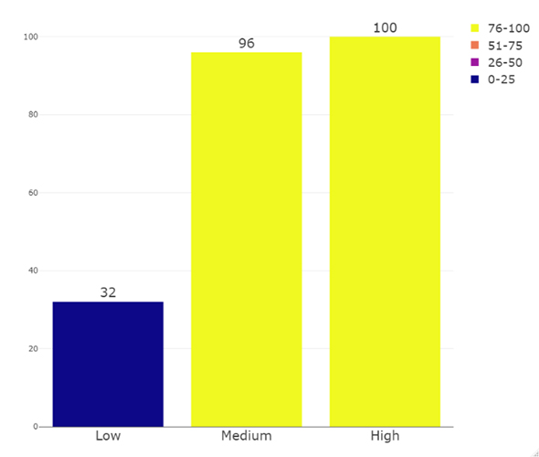
Description - Figure 8
An example of a bar plot with a discretized colour scale. Three bars are labelled High, Medium and Low. The height of the bars represents the data, the bars are labelled with the data value, and the bars are coloured according to the value of the bar using a discretized colour scale.
Figure 9
Description - Figure 9
An example of a graph showing the same three bars as Figure 8, but without the colour encoding and without the labels (High, Medium, Low).
Now compare figures 8 and 9 with noisier environments as shown in figures 10 to 12, which display some data with three categories that are not clearly separated. In cases like this, there's some empirical evidence that redundant encodings help to better segment the data, that is to say distinguish between the classes (Nothelfer et al., 2017). In Figure 10 the category is encoded only by shape, in Figure 11 the category is encoded only by colour and in Figure 12 the category is encoded redundantly using both shape and colour. Looking at the shape alone (Figure 10), it's more difficult to segment the categories. In figures 11 and 12, it's easier to tell that a category has a lower variance than the other categories, is closely grouped near the origin, and that the third category is more spread out. In a high-noise display such as this one, using redundancy rather than introducing clutter as in the previous example, can actually help cut through the noise to better delineate between the categories. However, the different categories are already fairly clearly segmented using colour. This is likely because colour is more effective encoding than shape for distinguishing between groups. The redundant encoding may not add much in this case, making it more of an aesthetic choice.
Figure 10
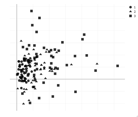
Description - Figure 10
An example of a scatterplot with three categories in a noisy display encoded by shape only (circle, triangle, square).
Figure 11
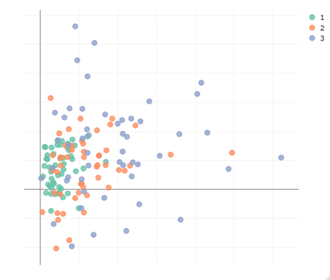
Description - Figure 11
An example of a scatterplot with three categories in a noisy display encoded by colour only (green, orange, blue).
Figure 12
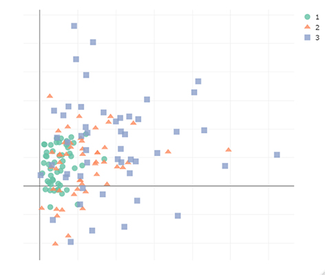
Description - Figure 12
An example of a scatterplot with three categories in a noisy display encoded redundantly by both colour and shape (green circle, orange triangle, blue square).
It is important to consider the difference between redundancy and clutter when designing visualizations. In simple visuals, it's unlikely that redundant encodings will make the visual clearer and will just amount to clutter. In a noisier display, there is some empirical evidence to suggest that redundant encodings can help; however, choosing a single highly effective encoding can also work well. Redundancy in a noisy display probably doesn't hurt and becomes more of a stylistic choice.
Conclusion
Good visuals are critical to telling the story of data as effectively as possible, and an effective visualization can make the data more easily understood to a wider audience. For a visualization to be effective, it needs to faithfully represent the underlying data. There are some problems that frequently occur in data visualization that can lead to misinterpretation. Some understanding of visual perception theory can help data scientists minimize distortion and provide better designs that improve the interpretability of their data visualizations. Showing too much data can also be misleading as it can result in occlusion. Consider simple adjustments, such as size and transparency, to help reduce occlusion and consider if plotting all the data is necessary for the purpose of the visualization. And finally, choose cleanliness over redundancy when possible. Redundant encodings often don't add much value, and the clutter they create can take away from the story.
References
Chun, R. (2017). Redundant Encoding in Data Visualizations: Assessing Perceptual Accuracy and Speed. Visual Communication Quarterly, 24(3), 135-148.
Mackinlay, J. (1986). Automating the design of graphical presentation of relational information. ACM Transactionson Graphics, 5(2), 110-141.
Nothelfer, C., Gleicher, M.,& Franconeri, S. (2017). Redundant encoding strengthens segmentation and grouping in visual displays of data. Journal of Experimental Psychology: Human Perception and Performance, 43(9), 1667–1676.
Stevens, S. S. (1957). On the psychophysical law. Psychological Review, 64(3), 153–181.
Trapp, M., Dumke,F., & Döllner, J. (2019). Occlusion Management Techniques for the Visualization of Transportation Networks in Virtual 3D City Models. Proceedings of the 12th International Symposium on Visual Information Communication and Interaction
Wang, L., Zhao, H., Wang, Z., Wu, J.,Li, B., He, Z., & Popescu, V. (2019). Occlusion Management in VR: A Comparative Study. 2019 IEEE Conference on Virtual Reality and 3D User Interfaces (VR), 708-706.
- Date modified: