
Low Code UI with Plotly Dash
By: Jeffery Zhang, Statistics Canada
Introduction
Often with data science work, we build models that are implemented in R or Python. If these models are intended for production, they'll need to be accessible to non-technical users.
A major problem with making data models accessible to non-technical users in production is the friction of creating accessible user interfaces. While it is acceptable for a research prototype to be run via a command line, this type of interface, with all its complexities, is very daunting to a non-technical audience.
Most data scientists are not experienced user interface (UI) developers, and most projects don't have the budget for a dedicated UI developer. In this article, we introduce a tool that allows non-UI specialists to quickly create good enough data UI using Python.
What is Plotly Dash?
Plotly is an open-source data visualization library. Dash is an open-source low-code data application development framework that is built on top of Plotly. Plotly Dash offers a solution to the data UI problem. A non-UI specialist data scientist can develop good enough UI for a data app in just a few days with Plotly Dash in Python. In most projects, investing 2-5 extra work-days to develop an interactive graphical UI is well worth the investment.
How does Plotly Dash work?
Plotly and Dash can be thought of as domain specific languages (DSL). Plotly is a DSL for describing graphs. The central object of Plotly is a Figure, which describes every aspect of a graph such as the axes, as well as graphical components such as bars, lines, or pie slices. We use Plotly to construct Figure objects and then use one of the available renderers to render it to the target output device such as a web browser.
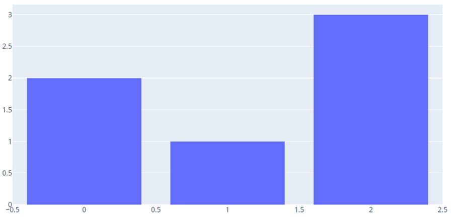
Description - Figure 1: Example of a Plotly figure
This is an example of a figure generated by Plotly. It is an interactive bar chart that allows the user to hover over the individual bars with the mouse and see the data values associated with each bar.
Dash provides two DSLs and a web renderer for Plotly Figure objects.
The first Dash DSL is for describing the structure of a web UI. It includes components for HTML elements such as div, p as well as UI controls such as Slider, DropDown. One of the key components of the Dash web DSL is the Graph component, which allows us to integrate a Plotly Figure into the Dash web UI.
Here's an example of a minimal Dash application.
From dash import Dash, html, dcc, callback, Output, Input
import plotly.express as px
import pandas as pd

df = pd.read_csv('https://raw.githubusercontent.com/plotly/datasets/master/gapminder_unfiltered.csv')

app = Dash(__name__)

app.layout = html.Div([
    html.H1(children='Title of Dash App', style={'textAlign':'center'}),
    dcc.Dropdown(df.country.unique(), 'Canada', id='dropdown-selection'),
    dcc.Graph(id='graph-content')
])

if __name__ == '__main__':
    app.run_server(debug=True)
This is what it looks like in a web browser.
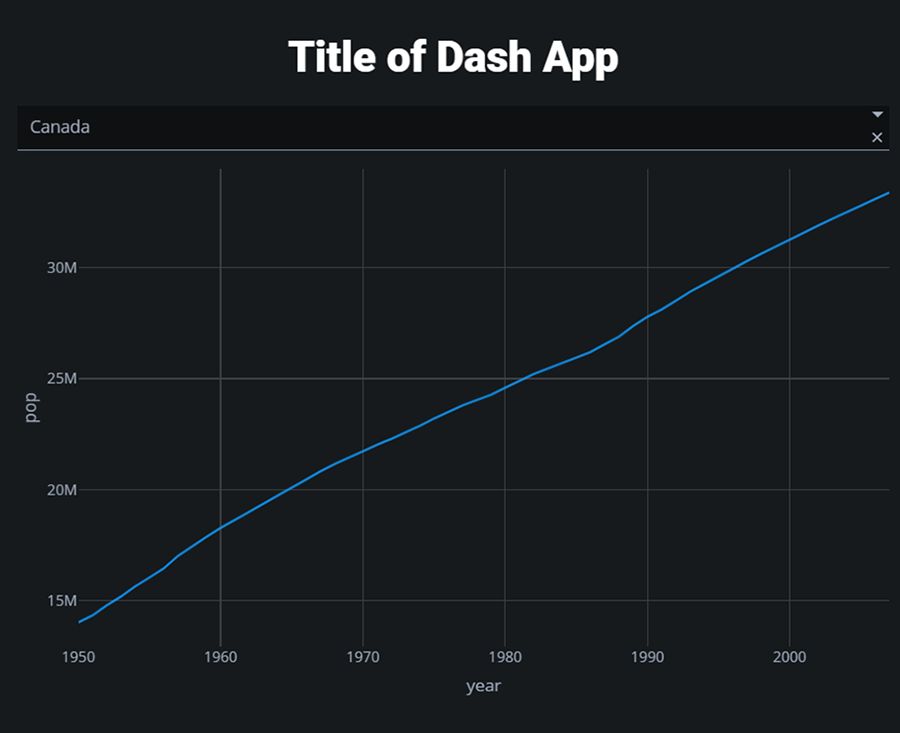
Description - Figure 2: Minimal app displayed in a browser.
This is an example of a minimal application created with Plotly Dash. It is a sample application that visualizes the growth of the Canadian population from 1950 to present using a line chart. The visualization is interactive and the user can hover the mouse over points on the blue line to see the data values associated with that point.
The second Dash DSL is for describing reactive data flows. This allows us to add interactivity to the data app by describing how data flows from user input components to the data model, and then back out to the UI.
Adding the following code to the above example creates a reactive data flow between the input component dropdown-selection, the function update graph, and the output graph. Whenever the value of the input component dropdown-selection changes, the function update graph is called with the new value of dropdown-selection and the return value of update-graph is output to the figure property of the graph-content object. This updates the graph based on the user's selection in the drop-down component.
@callback(
    Output('graph-content', 'figure'),
    Input('dropdown-selection', 'value')
)
def update_graph(value):
    dff = df[df.country==value]
    return px.line(dff, x='year', y='pop')
Useful features of Dash
Below are some common data app scenarios and how Dash features support those scenarios.
Waiting for long computations
Sometimes a data model will take a long time to run. It makes sense to give the user some feedback during this process so they know the data model is running and the application hasn't crashed. It would be even more useful to give a progress update so the user knows roughly how much work has been completed and how much is remaining.
We may also realize we made a mistake when setting the parameters of a long running job, and we'd like to cancel the running job and start over after making corrections. The Dash feature for implementing these scenarios is called Background callbacks.
Here's an example of a simple Dash application that features a long running job with the progress bar and cancellation.
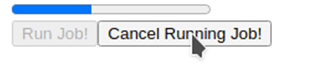
Description - Figure 3: Long running job with progress bar and cancellation
This is an example of a Plotly Dash application involving a long running task with a progress bar to display the progress of the task. It has 2 buttons. The "Run Job!" button is initially enabled and clicking it starts the task and the progress bar. Once the task is running, the "Run Job!" button becomes disabled, and the "Cancel Running Job!" button becomes enabled while the task is running. Clicking it before the task is complete will cancel the running task.
Duplicate callbacks
Normally, the value of an output is uniquely determined by one callback. If there are multiple callbacks that update the same output, we'd face the scenario that the output has multiple values at the same time, and we'd not know which is the correct one.
However, sometimes we might want to take the risk of binding multiple callbacks to the same output to make things simpler. Dash allows us to do this by explicitly specifying that we're willing to allow duplicate outputs. This feature is enabled by setting the allow duplicate parameter on Output to True. Here's an example:
app.layout = html.Div([
    html.Button('Draw Graph', id='draw-2'),
    html.Button('Reset Graph', id='reset-2'),
    dcc.Graph(id='duplicate-output-graph')
])

@app.callback(
    Output('duplicate-output-graph', 'figure', allow_duplicate=True),
    Input('draw-2', 'n_clicks'),
    prevent_initial_call=True
)
def draw_graph(n_clicks):
    df = px.data.iris()
    return px.scatter(df, x=df.columns[0], y=df.columns[1])

@app.callback(
    Output('duplicate-output-graph', 'figure'),
    Input('reset-2', 'n_clicks'),
)
def reset_graph(input):
    return go.Figure()

app.run_server(debug=True)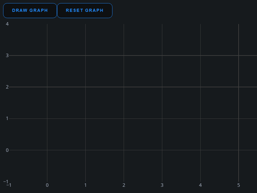
Description - Figure 4: Graph that is updated by two different buttons.
This is an example of a Plotly Dash application that uses duplicate callbacks. It has 2 buttons that both target the same output, which is the graph below. Clicking the "Draw Graph" button renders the graph, while clicking the "Reset Graph" button clears the graph. Since both buttons target the same output, this scenario requires the duplicate callback feature of Dash.
In this case, we have two buttons for updating a graph: Draw and Reset. The graph will be updated by the last button that was pressed. While this is convenient, there's a risk to designing UI this way. On the desktop with one mouse pointer, button clicks can be assumed to be unique in time. However, on a multi-touch screen such as a smartphone or tablet, two buttons can be clicked at the same time. In general, once we allow duplicate callbacks, the output becomes potentially indeterminate. This can lead to some bugs that are very difficult to replicate.
This feature is both convenient and potentially dangerous. So use at your own risk!
Custom components
Sometimes the set of components that come with Dash are not enough. The web UI of Dash is built with React, and Dash provides a convenient tool for integrating custom React components into Dash. It's beyond the scope of this article to go into the details of React and Dash-React integration. However, you can read more about this – see: Build your own components.
Error display
Sometimes an error occurs during computation that is due to problems with the data, the code, or user error. Instead of crashing the application, we might want to display the error to the user and provide some feedback on what they can do to rectify it.
There are two Dash features that are used for this scenario: multiple outputs and dash.no_update.
multiple outputs is a Dash feature that allows callbacks to return multiple outputs in the form of a tuple.
dash.no_update is a value that can be returned in an output slot to represent no change in that output.
Here's an example that uses both of these features to implement an error display:
@app.callback(
    Output('out', 'text'),
    Output('err', 'text'),
    Input('num', 'value')
)
def validate_num(num):
    if validate(num):
        return "OK", ""
    else:
        return dash.no_update, "Error"
Partial Updates
Since Dash callback computations occur on the server, to display the results on the client, all the return values from the callback have to be sent to the client on each update.
Sometimes these updates will involve very large Figure objects, which consume a lot of bandwidth and slow the update process. This will negatively impact the user experience. The simple way to implement callback updates is to perform monolithic updates on large data structures such as Figure even if only a small part of it has change, such as the title.
To optimize bandwidth usage and improve the user experience, Dash has a feature called Partial Update. This feature introduces a new type of return value to callbacks called a Patch. A Patch describes which subcomponents of a larger data structure should be updated. This allows us to avoid sending an entire data structure across the network when only a portion of it needs to be updated.
Here is an example of Partial Updates that updates only the font colour title for the figure instead of the whole figure:
From dash import Dash, html, dcc, Input, Output, Patch
import plotly.express as px
import random

app = Dash(__name__)

df = px.data.iris()
fig = px.scatter(
    df, x="sepal_length", y="sepal_width", color="species", title="Updating Title Color"
)

app.layout = html.Div(
    [
        html.Button("Update Graph Color", id="update-color-button-2"),
        dcc.Graph(figure=fig, id="my-fig"),
    ]
)

@app.callback(Output("my-fig", "figure"), Input("update-color-button-2", "n_clicks"))

def my_callback(n_clicks):
    # Defining a new random color
    red = random.randint(0, 255)
    green = random.randint(0, 255)
    blue = random.randint(0, 255)
    new_color = f"rgb({red}, {green}, {blue})"

    # Creating a Patch object
    patched_figure = Patch()
    patched_figure["layout"]["title"]["font"]["color"] = new_color
    return patched_figure

if __name__ == "__main__":
    app.run_server(debug=True)
Dynamic UI and pattern matching callbacks
Sometimes, we can't define the data flow statically. For example, if we want to implement a filter stack that allows the user to flexibly add filters, the specific filters that the user will add won't be known ahead of time. If we want to define data flows involving the input components that the user adds at runtime, we can't do it statically.
Here's an example of a dynamic filter stack where the user can add new filters by clicking the ADD FILTER button. The user can then select the value of the filter via the drop down that is dynamically added.
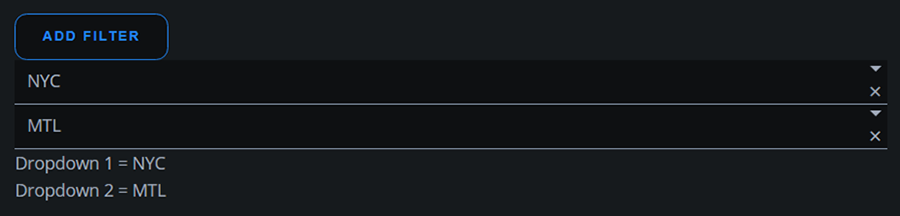
Description - Figure 5: Dynamic filter stack
This is an example of a Plotly Dash application that uses dynamic UI and pattern matching callbacks. Clicking the "Add Filter" button adds an additional dropdown box. Since the dropdown boxes are added dynamically, we cannot bind them to callbacks ahead of time. Using the pattern matching callback feature of Dash allows us to bind dynamically created UI elements to callbacks by using a pattern predicate.
Dash supports this scenario by allowing us to bind callbacks to data sources dynamically via a pattern matching mechanism.
The follow code implements the above UI:
From dash import Dash, dcc, html, Input, Output, ALL, Patch

app = Dash(__name__)

app.layout = html.Div(
    [
        html.Button("Add Filter", id="add-filter-btn", n_clicks=0),
        html.Div(id="dropdown-container-div", children=[]),
        html.Div(id="dropdown-container-output-div"),
    ]
)


@app.callback(
    Output("dropdown-container-div", "children"), Input("add-filter-btn", "n_clicks")
)
def display_dropdowns(n_clicks):
    patched_children = Patch()
    new_dropdown = dcc.Dropdown(
        ["NYC", "MTL", "LA", "TOKYO"],
        id={"type": "city-filter-dropdown", "index": n_clicks},
    )
    patched_children.append(new_dropdown)
    return patched_children


@app.callback(
    Output("dropdown-container-output-div", "children"),
    Input({"type": "city-filter-dropdown", "index": ALL}, "value"),
)
def display_output(values):
    return html.Div(
        [html.Div(f"Dropdown {i + 1} = {value}") for (i, value) in enumerate(values)]
    )


if __name__ == "__main__":
    app.run_server(debug=True)
Instead of defining the DropDown components statically, we create a dropdown-container-div which serves as a container for all the DropDown components that the user will create. When we create the DropDown components in display_dropdowns, each new DropDown component is created with an id. Normally this id value would be a string, but in order to enable pattern matching callbacks, Dash also allows the id to be a dictionary. This could be an arbitrary dictionary, so the specific keys in the above example are not special values. Having a dictionary id allows us to define very fine-grained patterns to be matched over each key of the dictionary.
In the above example, when the user adds new DropDown components, the id of the dynamic DropDown components are tagged with ids in sequence that looks like this:
- '{"type": "city-filter-dropdown", "index": 1}
- '{"type": "city-filter-dropdown", "index": 2}
- '{"type": "city-filter-dropdown", "index": 3}
Then, in the metadata for the display_output callback, we define its input as Input({"type": "city-filter-dropdown", "index": ALL}, "value") which then match all components where the id has type equal to city-filter-dropdown. Specifying "index": ALL means that we match any index value.
In addition to ALL, Dash also supports additional pattern matching criteria such as MATCH and ALLSMALLER. To learn more about this feature, visit Pattern Matching Callbacks.
Examples
Here are some examples of apps built with Dash:
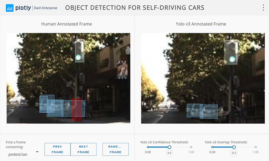
Description - Figure 6: Object detection
This is an example of a Plotly Dash application that is used for Object Detection. It visualizes the bounding boxes of the detected objects in a scene.
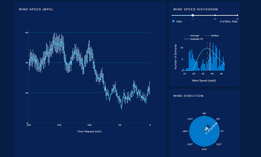
Description - Figure 7: Dashboard
This is an example of a Plotly Dash dashboard application. It visualizes wind speed and direction data.
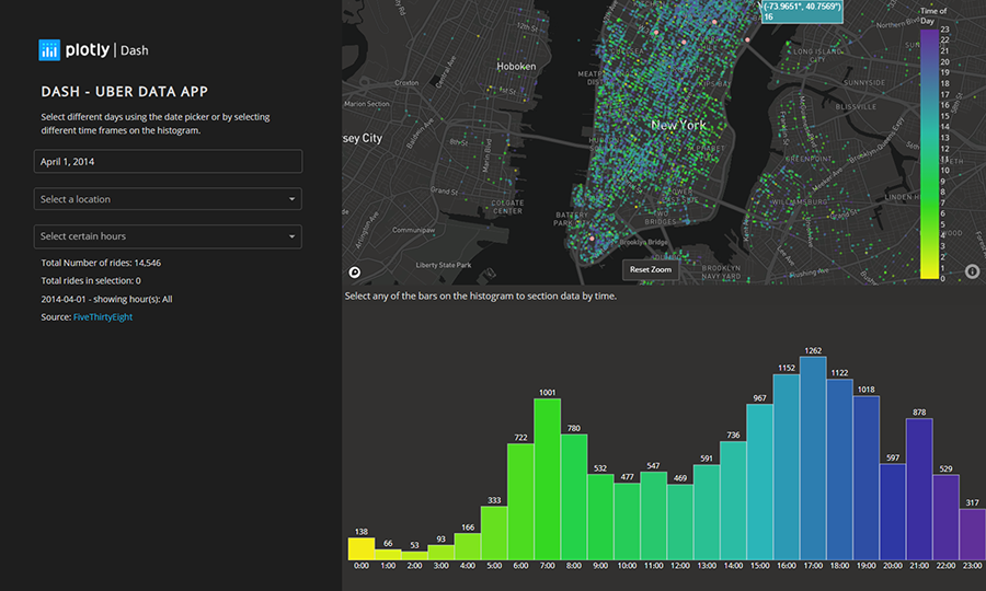
Description - Figure 8: Uber Rides
This is an example of a Plotly Dash dashboard application. It visualizes the temporal and spatial distribution of Uber rides in Manhattan.
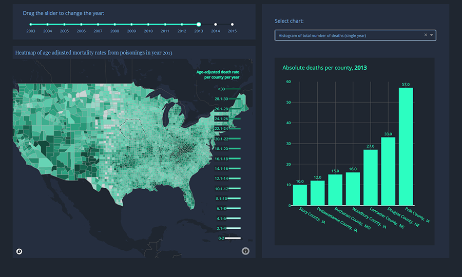
Description - Figure 9: Opioid map
This is an example of a Plotly Dash dashboard application. It visualizes the spatial distribution of opiod deaths in the US at the county level.
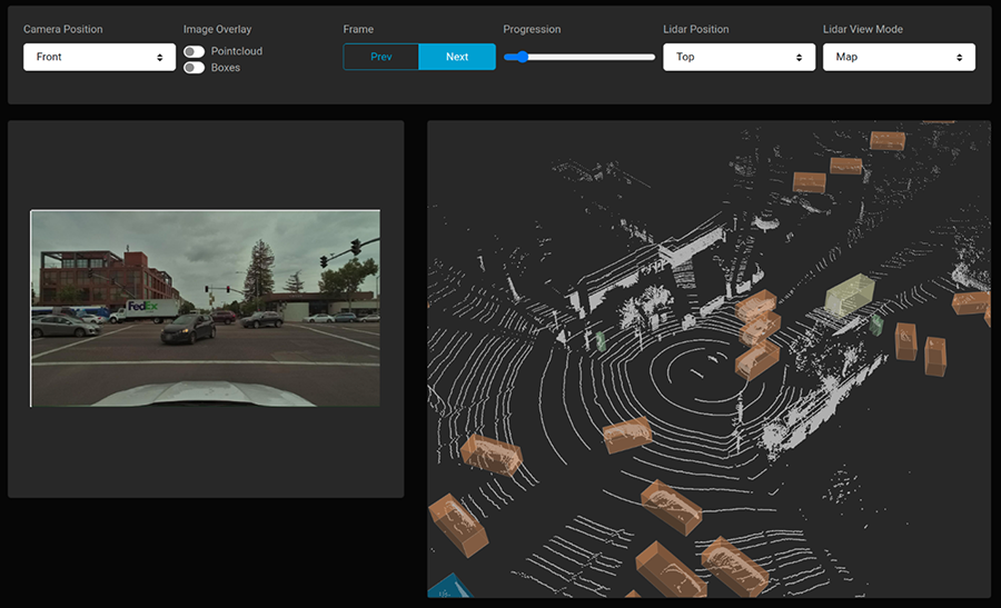
Description - Figure 10: Point Cloud
This is an example of a 3D visualization application developed using Plotly Dash. It visualizes the 3D point cloud data collected from a LIDAR from the perspective of a car.
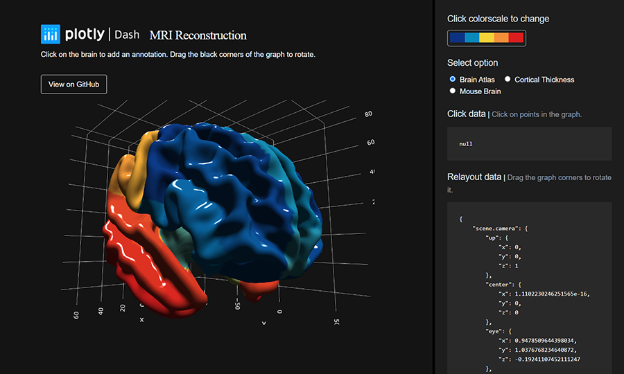
Description - Figure 11: 3D Mesh
This is an example of a 3D mesh visualization application developed using Plotly Dash. It visualizes the reconstruction of the brain using MRI data.
For more examples, visit the Dash Enterprise App Gallery.
Conclusion
Good UI has the potential to add value to projects by making the project deliverables more presentable and usable. For production systems that will be used for a long time, the upfront investment in UI can pay dividends over time with a lower learning curve, reduce user confusion, and improve user productivity. Plotly Dash helps to significantly lower the cost of UI development for data apps, this can help increase the return on investment in UI development for data apps.
Meet the Data Scientist

If you have any questions about my article or would like to discuss this further, I invite you to Meet the Data Scientist, an event where authors meet the readers, present their topic and discuss their findings.
Thursday, June 15
1:00 to 4:00 p.m. ET
MS Teams – link will be provided to the registrants by email
Register for the Data Science Network's Meet the Data Scientist Presentation. We hope to see you there!
Subscribe to the Data Science Network for the Federal Public Service newsletter to keep up with the latest data science news.
Reference
- Plotly: Low-Code Data App Development
- Background callbacks: Plotly - Background Callbacks
- Custom Components: Plotly - Build Your Own Components
- Pattern matching callbacks: Plotly - Pattern-Matching Callbacks
- Date modified: