
Forecasting power consumption in remote northern Canadian communities
By: Alireza Rahimnejad Yazdi, Lingjun Zhou and Zarrin Langari, Digital Accelerator, Natural Resources Canada; Ryan Kilpatrick, CanmetENERGY Ottawa, Natural Resources Canada
Introduction
Natural Resources Canada (NRCan) has been helping northern and remote Canadian communities transition from traditional fossil fuel-based power to renewable, green energy. Most of these communities are geographically isolated and powered by fossil fuel generators. To support this initiative, researchers at NRCan needed to accurately forecast these communities' annual power consumption to determine what kind of renewable energy would best support these communities. To do this, they used historical data with an hourly resolution, as well as population and weather data. By coming up with a typical hourly power consumption profile for any community, we can reasonably estimate the hourly power usage for communities lacking historical data.
With publicly available data provided by its client NRCan's CanmetENERGY Ottawa (CE-O), the Digital Accelerator team focused the analysis on power consumption data of 11 remote communities in the Nunavik region of northern Quebec. The data was given at hourly resolution for years 2013, 2014, 2015. Given that this analytical approach uses the average power consumption across these three available years, the power consumption data of a given year leaks into the model that is used to make a prediction for that year, and this leakage undermines the validity of any measured performance metrics.
We consider that remote community electricity consumption has a nonlinear relationship with variables, such as weather, population, age/efficiency of appliances, building age, and in the case of electric heating, occupancy rates and habits. However, since most traditional prediction approaches lack a learning mechanism, it's difficult to describe the nonlinear relationship between electricity consumption and influencing variables, which results in low forecast accuracy.
Our analysis will determine if machine learning (ML) techniques can produce a more accurate prediction of remote community electric loads compared to CE-O's analytical approach and determine which type of ML techniques is the most appropriate for this application. We also hope to apply the selected ML technique to create typical hourly synthetic diesel electric load profiles to the set of remote communities missing the granular hourly power usage data.
Before we did this, we assumed the following:
- The communities' populations stay constant throughout the entire year, which means at every point in time, a house has the same number of occupants and don't have snowbirds, for example.
- There are no major temperature fluctuations. With the advent of climate change, extreme weather phenomena such as extremely hot or cold spells in a short period of time, could lead to inaccurate modeling.
- There are no major changes in latent variables that could contribute to power consumption not included in the dataset. This is a very strong requirement, given that we don't know what these latent variables are.
Data preprocessing and exploratory data analysis
An exploratory data analysis (EDA) was performed to investigate the data by discovering patterns, spotting anomalies, and checking for the presence of missing data with the help of summary statistics and graphical representations. We also identified typical energy use features for any community during EDA to help estimate the granular level power usage for communities with only annual/total power consumption data.
Various models such as linear regression, LGBM (light gradient boosting machine), XGBoost, Theta Forecaster, Ensemble Forecaster, Auto-ARIMA, Auto-ETS, naïve forecast, Fast Fourier Transformation and neural networks were used to make forecasts and their performances were compared.
As part of the data preparation, population and power consumption data were combined by calculating the power consumption per capita. Then, the power consumption data per capita were plotted over time. Power consumption data have three components: trends, seasonality, and noise. Features in the data were assumed to hold predictive power and were therefore chosen to be used in the final model.
The latitude and longitude information varied too little to provide meaningful input and were discarded for this stage. Visualization showed the following information:
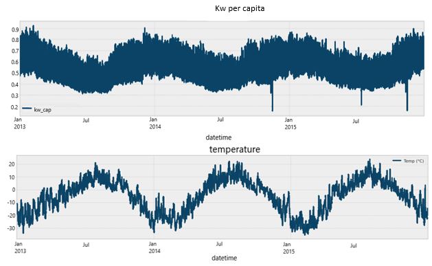
Figure 1. The x-axis for two plots below is datetime, the first hour being 12:00 am, Jan 01, 2013
Two-line charts plotting the power consumption per capita against the datetime, and temperature against the datetime. The power consumption per capita has obvious dips during the warmer months, such as July, and peaks over colder months, such as January. The temperature and power consumption per capita are negatively correlated.
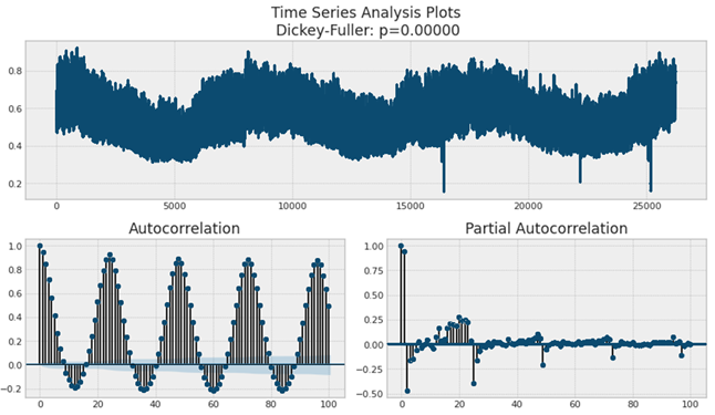
Figure 2. Note that the x-axis above is hour, where 12:00 am, Jan 01, 2013, is the first hour and 11:00pm, Dec 31, 2015, is the last hour.
The autocorrelation and partial autocorrelation calculations for power consumption per capita data. The autocorrelation and partial autocorrelation plots both show peaks every 24 hours indicating a strong correlation every 24 hours. This means the exact same hour of a previous and current day share similar power usages.
There are in total 26,280 hours over three years. Both autocorrelation (ACF) and partial autocorrelation (PACF) show that there's a strong correlation every 24 hours. This makes sense because the daily power consumption usually follows a repeatable pattern. The PACF is the ACF with the intermediate correlations removed. For example, PACF of lag 3 is the ACF of lag 3 minus the ACF of lag 1 and 2. Autocorrelation and Partial Autocorrelation in Time Series Data gives a detailed discussion for their differences. We can see clearly from the PACF that power usage is strongly correlated with its own value 24 hours prior.
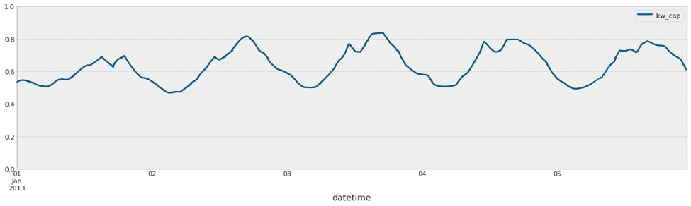
Figure 3. A zoomed-in version of the historical power consumption data. The x-axis here is datetime, to the precision of hours.
A zoomed-in version of the power consumption per capita against datetime. We can see peak usage approximately every 24 hours.
The following is a summary of the patterns we found in the images above.
- There's an inverse relationship between normalized temperature and power consumption per capita.
- There's a weak increasing trend in power consumption, but overall, there's a repeated annual pattern.
- Within a year, power usages go up in cold months and down in warmer months. Note that how much power usage goes up in cold months, and down in warmer months differs from community to community.
- Within a day, there's higher power usage during wake hours than during rest hours, with the peak around midday. Note that the peak value differs from community to community.
Results
The following image is a forecast based on neural networks. Forecasts with other algorithms have similar appearances.
![A simulated power consumption per capita forecast for next year (in orange) plotted against the actual next year's power consumption per capita data (in blue). We can see the simulated power usage almost overlaps with the actual power usage. After comparing the performance of various algorithms with mean absolute percentage error (MAPE), we obtained to the results specified in Table 1.]](/sites/default/files/images/powerconsumptionfig5.png)
Figure 4. The x-axis is hours, with 12:00 am, Jan 01, 2013, as the first hour.
A simulated power consumption per capita forecast for next year (in orange) plotted against the actual next year's power consumption per capita data (in blue). We can see the simulated power usage almost overlaps with the actual power usage.
After comparing the performance of various algorithms with mean absolute percentage error (MAPE), we obtained to the results specified in the below table.
| Community | Neural Network MAPE | LGBM MAPE | Linear MAPE | Theta MAPE | Naïve MAPE | Manual approach | ||
|---|---|---|---|---|---|---|---|---|
| 2013 | 2014 | 2015 | ||||||
| Inukjuak | 7.1% | 6.7% | 6.5% | 8.2% | 7.7% | 12.9% | 7.5% | 4.9% |
| Salluit | 6.2% | 6.8% | 6.7% | 6.7% | 6.1% | 7.7% | 6.0% | 5.0% |
| Quaqtag | 10.7% | 8.8% | 8.3% | 11.5% | 12.2% | 16.1% | 11.7% | 5.7% |
| Aupaluk | 7.9% | 8.8% | 8.8% | 13% | 7.8% | 10.2% | 9.5% | 8.6% |
| Ivujivik | 12.9% | 14.9% | 14.9% | 14.9% | 13.9% | 14.3% | 6.3% | 6.3% |
| Kuujjuaq | 4.4% | 5.3% | 5.4% | 7.4% | 5.4% | 5.0% | 4.7% | 5.4% |
| Kangirsuk | 8.1% | 11.0% | 10.8% | 9.0% | 8.8% | 8.4% | 8.4% | 7.8% |
| Umiujaq | 5.4% | - | - | - | - | 10.9% | 9.3% | 7.1% |
| Kuujjuarapik | 6.6% | 4.8% | 4.8% | 4.9% | 5.2% | 98.9% | 6.6% | 7.4% |
| Kangiqsualujjuaq | 7.9% | 7.4% | 7.5% | 11.7% | 7.1% | 8.1% | 9.0% | 8.4% |
| Puvirnituq | 6,2% | - | - | - | - | 12.5% | 7.5% | 5.5% |
- All the above approaches share similar procedures. We first conducted a temporal split on the data to arrive at a train and test data set. Then we trained the machine learning models on the training data and measured the performance by three different metrics that are commonly used for regression problems: MAE (mean absolute error), RMSE (root mean squared error) and MAPE. Finally, we tuned the hyperparameters to reach the best performance for each model.
- The neural network model has four layers. The first three layers have 32 units with relu activation and last layer has one unit with a linear activation. The loss function and optimizer are MSE (mean squared error) and RMS (root mean square) prop, respectively. Early stopping, the validation loss was used to stop train and avoid overfitting. MAPE of less than 10% was achieved for nine out of 11 communities.
- For the LGBM, Linear, and Theta forecaster model, we first decomposed the data by removing seasonality and trend to arrive at the residual, then trained the model on the residual and reversed the process to arrive at a prediction.
- The difference:
- LGBM is a tree-based model and fast to train
- Linear is a linear regression model and trained just as fast as LGBM
- Theta is an exponential smoothing model and took some time to train
- The difference:
- For naïve forecasting, we simply shifted the previous year's power consumption and used it as current year's power consumption prediction.
- The last column shows the manual approach used by CE-O that illustrates the difference between the predicted and measured power consumptions for the year 2013, 2014, and 2015, respectively. The reason there are three values is due to the way manual approach works.
Here are our observations based on the results:
- Across multiple communities, the various machine learning approaches and models provide similar accuracy. The complex neural network model is only slightly better but does not significantly outperform simpler models such as LGBM or Linear Regression.
- Naïve forecast, namely shifting the previous year's power consumption record as current year's power usage forecast, can provide just as good a result as any other model. This would not work if the increasing trend is stronger. Naïve forecast is surprisingly difficult to beat. This is common for time series prediction and comes from the observation that there is an evident annual repeated pattern in power consumption.
- There are other potentially useful algorithms such as Fourier analysis, LSTM (long short-term memory networks), Auto ARIMA,but they're all inefficient and computationally expensive to capture the repeatable pattern to produce meaningful results. At one point, the authors tried to use auto ARIMA to simulate the time series, but our GPU (graphics processing unit) workstation crashed after five and a half hours of intense computing. 260G of RAM was filled while its CPU (central processing unit) scores were running at 100%.
What we discovered
When compared to the manual approach, ML and naïve forecasting can, on average, perform two to three percent better.
The risk of large errors from the manual approach (16.1% and 98.9%) is significantly reduced. Machine learning approaches appear to be more stable. Given the fact that naïve forecasting can perform just as well as a machine learning algorithm, it might be more efficient to consider the use of a previous year's power consumption as our future forecast. However, we must ensure that there is an annual repeatable pattern in the data by conducting a thorough EDA.
The end goal is to create a "typical" hourly power consumption profile for communities with only external variables' history, such as weather data history. By "typical" power consumption profile, we mean the cookie-cutter results once external variables are given. For example, if two communities have the same climate data then they would have the same power consumption per capita at each hour of the year. We were limited from fulfilling this objective for a few reasons:
- We notice that the power consumption per capita are in the same order of numbers (in between 0.5 kw and 1.9 kw). However, an average person in some communities still uses significantly more power than in other communities. This will be a challenge for creating a "typical" power consumption profile for an average user in a "typical" community. Some type of normalization may be needed.
- In the community of Ivujivik, the power consumption for year 2014 does not match the patterns we identified through EDA. It fluctuates significantly throughout the year and does not fit the pattern of low power usage during warmer months and high-power usage during colder months. Further attention is needed to identify why this exists.
The future of this project
There's potential for this project to be extended. If we decide to move forward, a new agreement will be put in place to obtain more recent data with more diverse communities from more geo-locations and climate types/regions, and to collect higher resolution data and identify universal patterns across more datasets. If a richer and more diverse dataset is feasible, we would attempt to develop new models that can predict power consumption for communities without power usage records. We could explore the relationship between power consumption and external variables.
Meet the Data Scientist

If you have any questions about my article or would like to discuss this further, I invite you to Meet the Data Scientist, an event where authors meet the readers, present their topic and discuss their findings.
Tuesday, January 17
2:00 to 3:00 p.m. ET
MS Teams – link will be provided to the registrants by email
Register for the Data Science Network's Meet the Data Scientist Presentation. We hope to see you there!
Subscribe to the Data Science Network for the Federal Public Service newsletter to keep up with the latest data science news.
- Date modified: