5 Data Visualization
5.2 Bar chart
Text begins
A bar chart may be either horizontal or vertical. The important point to note about bar charts is their bar length or height—the greater their length or height, the greater their value. Bar charts are one of the many techniques used to present data in a visual form so that the reader may readily recognize patterns or trends.
Bar charts usually present categorical variables, discrete variables or continuous variables grouped in class intervals. They consist of an axis and a series of labelled horizontal or vertical bars. The bars depict frequencies of different values of a variable or simply the different values themselves. The numbers on the y-axis of a vertical bar chart or the x-axis of a horizontal bar chart are called the scale.
When developing bar charts manually, draw a vertical or horizontal bar for each category or value. The height or length of the bar will represent the number of units or observations in that category (frequency) or simply the value of the variable. Select an arbitrary but consistent width for each bar as well. Even though it is very common today that some software, such as a spreadsheet software or R software, is used to produce charts, it’s still quite useful to know how to create charts by hand.
Vertical bar charts
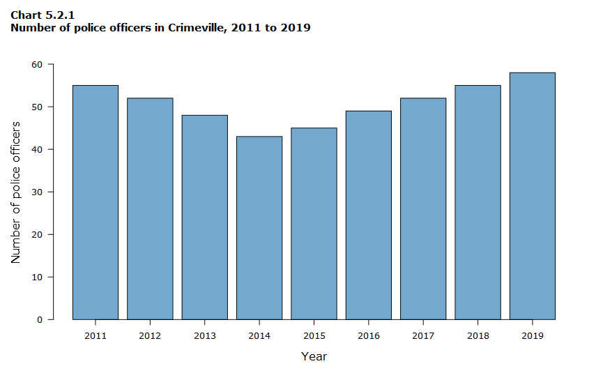
Bar charts should be used when you are showing segments of information. Vertical bar charts are useful to compare different categorical or discrete variables, such as age groups, classes, schools, etc., as long as there are not too many categories to compare. They are also very useful for time series data. The space for labels on the x-axis is small, but ideal for years, minutes, hours or months. For example, Chart 5.2.1 below shows the number of police officers in Crimeville for each year from 2011 to 2019.

Data table for Chart 5.2.1
| Year | Number of police officers |
|---|---|
| 2011 | 55 |
| 2012 | 52 |
| 2013 | 48 |
| 2014 | 43 |
| 2015 | 45 |
| 2016 | 49 |
| 2017 | 52 |
| 2018 | 55 |
| 2019 | 58 |
In Chart 5.2.1, you can see that the number of police officers decreased from 2011 to 2014, but started increasing again in 2015. The chart also makes it easy to compare the number of police officers for any combination of years.
Vertical bar charts are an excellent choice to emphasize a change in magnitude. The best information for a vertical bar chart is data dealing with the description of components, frequency distribution and time-series statistics.
Grouped bar charts
The grouped bar chart is another effective means of comparing sets of data about the same places or items. It gives two or more pieces of information for each item on the x-axis instead of just one as in Chart 5.2.1. This allows you to make direct comparisons on the same chart by age group, gender or anything else you wish to compare. However, if a grouped bar chart has too many series of data, the chart becomes cluttered and it can be confusing to read.
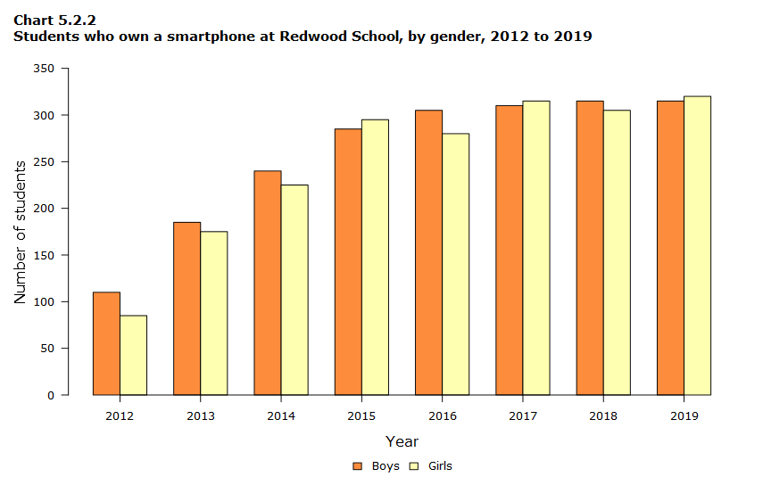
Chart 5.2.2, a grouped vertical bar chart, compares two series of data: the numbers of boys and girls that have a smartphone at Redwood Secondary School from 2012 to 2019. The orange bar represents the number of boys, and the yellow bar represents the number of girls.

Data table for Chart 5.2.2
| Year | Number of boys | Number of girls |
|---|---|---|
| 2012 | 110 | 85 |
| 2013 | 185 | 175 |
| 2014 | 240 | 225 |
| 2015 | 285 | 295 |
| 2016 | 305 | 280 |
| 2017 | 310 | 315 |
| 2018 | 315 | 305 |
| 2019 | 315 | 320 |
Horizontal bar charts
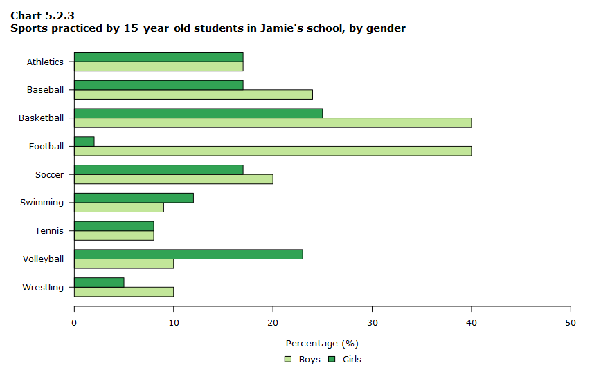
One disadvantage of vertical bar charts, however, is that they lack space for text labelling at the foot of each bar. When category labels in the chart are too long, you might find a horizontal bar chart better for displaying information, like the example in Chart 5.2.3.

Data table for Chart 5.2.3
| Sport | Percentage of boys (%) | Percentage of girls (%) |
|---|---|---|
| Athletics | 17 | 17 |
| Baseball | 24 | 17 |
| Basketball | 40 | 25 |
| Football | 40 | 2 |
| Soccer | 20 | 17 |
| Swimming | 9 | 12 |
| Tennis | 8 | 8 |
| Volleyball | 10 | 23 |
| Wrestling | 10 | 5 |
Stacked bar charts
There are several other types of bar chart that you may encounter. The population pyramid is a special application of a grouped bar chart. Another useful type of bar chart is the stacked bar chart.
The stacked bar chart is a preliminary data analysis tool used to show segments of totals. The stacked bar chart can be very difficult to analyze if too many items are in each stack. It can contrast values, but not necessarily in the simplest manner.
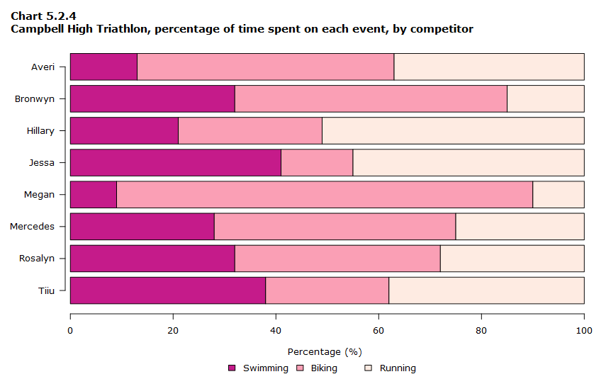
In Chart 5.2.4, it is easy to analyze the data presented since there are only three items in each stack: swimming, running and biking. It is easy to see at a glance what percentage of time each woman spent on an event. Had this been a chart representing a decathlon (with 10 events) the data would have been significantly harder to analyze.

Data table for Chart 5.2.4
| First name | Percentage of time spent swimming (%) | Percentage of time spent cycling (%) | Percentage of time spent running (%) |
|---|---|---|---|
| Averi | 13 | 50 | 37 |
| Bronwyn | 32 | 53 | 15 |
| Hillary | 21 | 28 | 51 |
| Jessa | 41 | 14 | 45 |
| Megan | 9 | 81 | 10 |
| Mercedes | 28 | 47 | 25 |
| Rosalyn | 32 | 40 | 28 |
| Tiiu | 38 | 24 | 38 |
Advices to build bar charts
You should keep the following guidelines in mind when creating bar charts:
- Make bars and columns wider than the space between them.
- Use a single font type on a chart. Try to maintain a consistent font style from chart to chart in a single presentation or document.
- Order your shade pattern from darkest to lightest.
- Avoid using a combination of red and green in the same display.
- Date modified: