
5 Data Visualization
5.3 Pictograph
Text begins
A pictograph uses picture symbols to illustrate statistical information. It is often more difficult to visualize data precisely with a pictograph. This is why pictographs should be used carefully to avoid misrepresenting data either accidentally or deliberately.
Chart 5.3.1 shows a scale that represents the number of elementary students who prefer chocolate chip cookies. This type of pictograph shows how a symbol can be used to represent data. One cookie symbol represents two students, and a half-cookie symbol is used to represent one student. These data could easily have been presented in a bar chart using a scale to present the figure rather than a symbol.
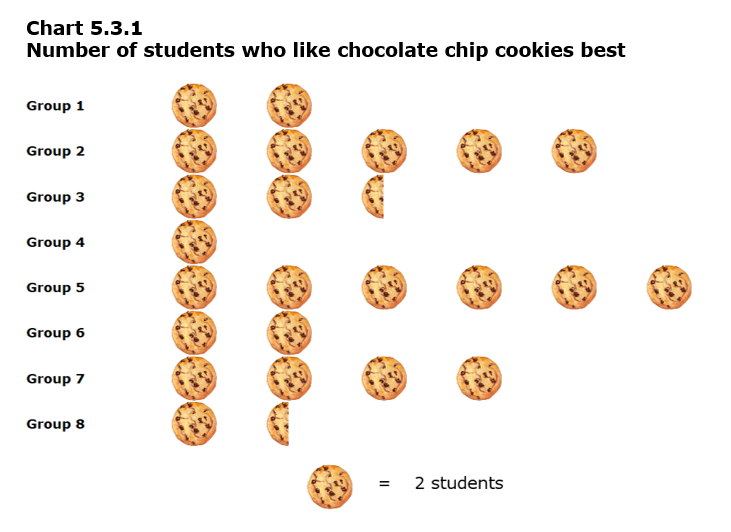
Data table for Chart 5.3.1
| Group | Number of cookies |
|---|---|
| 1 | 2 |
| 2 | 5 |
| 3 | 2.5 |
| 4 | 1 |
| 5 | 6 |
| 6 | 2 |
| 7 | 4 |
| 8 | 1.5 |
| Note: Each cookie represents two students | |
Now let us look at another example of a pictograph.
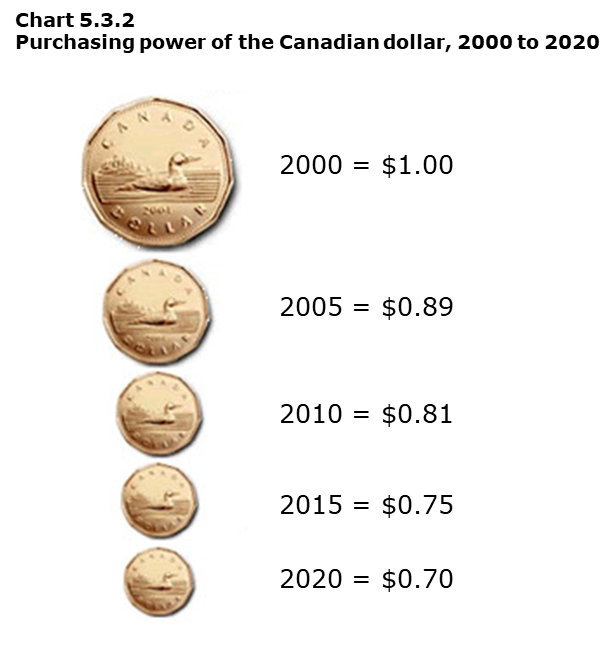
Data table for Chart 5.3.2
| Year | Purchasing power ($) |
|---|---|
| 2000 | 1.00 |
| 2005 | 0.89 |
| 2010 | 0.81 |
| 2015 | 0.75 |
| 2020 | 0.70 |
Chart 5.3.2 shows how the Canadian dollar shrank to a value of 70 cents over 20 years because of inflation. This information means the value of the 2020 Canadian dollar was worth 70% of the value of the 2000 Canadian dollar! What is the problem with the depiction of statistics in this pictograph?
The size or area (total surface) of the dollars coin (loonie) pictograph is misleading. The dollar value differences represented are exaggerated by the pictures. They should reflect the actual purchasing power of the dollar of the years in question. Since 70 cents is over half of one dollar, the 2020 loonie should appear bigger than half the size of the 2000 loonie, which is not the case here.
You may argue that people do not notice this misrepresentation when they look at a pictograph such as this one, and thus it is not particularly important. The fact is that subconsciously many people may interpret the Canadian dollar to have lost far more of its value than it has in reality. Since many people use statistical information in making decisions, accuracy is important. In this case, the shrinking value of the Canadian dollar can affect people’s perception about their ability to save money or their confidence in the Canada’s economy.
If not drawn carefully, pictographs can be inaccurate. Statistics Canada rarely uses pictographs to release statistical information, but the media uses them quite frequently.
- Date modified: