
5 Data Visualization
5.5 Line chart
Text begins
Line charts, especially useful in the fields of statistics and science, are more popular than all other graphs combined because their visual characteristics reveal data trends clearly and these charts are easy to create.
A line chart is a visual comparison of how two variables—shown on the x- and y-axes—are related or vary with each other. It shows related information by drawing a continuous line between all the points on a grid.
Line charts compare two variables: one is plotted along the x-axis (horizontal) and the other along the y-axis (vertical). The y-axis in a line chart usually indicates quantity (e.g. dollars, litres) or percentage, while the horizontal x-axis often measures units of time. As a result, the line chart is often viewed as a time series graph. For example, if you wanted to graph the height of a baseball pitch over time, you could measure the time variable along the x-axis, and the height along the y-axis. Although they do not present specific data as well as tables do, line charts are able to show relationships more clearly than tables do. Line charts can also depict multiple series and hence are usually the best candidate for time series data and frequency distribution.
Vertical bar charts and line charts share a similar purpose. The vertical bar chart, however, reveals a change in magnitude, whereas the line chart is used to show a change in direction.
In summary, line charts:
- show specific values of data well,
- reveal trends and relationships between data,
- compare trends in different groups.
Graphs can give a distorted image of the data. If scales on the axes of a line graph force data to appear a certain way, then a graph can even reveal a trend that is entirely different from the one intended. This happens when the intervals between adjacent points along the axis may be dissimilar, or when the same data charted in two graphs using different scales appear different.
Example 1 – Plotting a trend over time
Chart 5.5.1 shows one obvious trend, the fluctuation in the labour force from January to July. The number of students at Andrew’s high school who are members of the labour force is scaled using intervals on the y-axis, while the time variable is plotted on the x-axis.
The number of students participating in the labour force was 252 in January, 252 in February, 255 in March, 256 in April, 282 in May, 290 in June and 319 in July. When examined further, the line chart indicates that the labour force participation of these students was at a plateau for the first four months (January to April), and for the next three months (May to July) the number increased steadily.
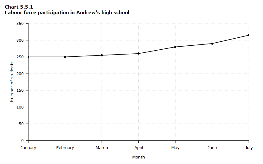
Data table for Chart 5.5.1
| Month | Number of students |
|---|---|
| January | 250 |
| February | 250 |
| March | 255 |
| April | 260 |
| May | 280 |
| June | 290 |
| July | 315 |
Example 2 – Comparing two related variables
Chart 5.5.2 is a single line chart comparing two items. In this example, time is not a factor. The chart compares the average number of dollars donated by the age of the donors. According to the trend in the chart, the older the donor, the more money he or she donates. The 17-year-old donors donate, on average, $84. For the 19-year-olds, the average donation increased by $26 to make the average donation of that age group $110.
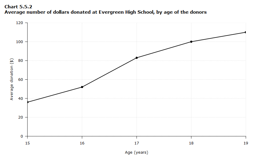
Data table for Chart 5.5.2
| Age | Average donation ($) |
|---|---|
| 15 | 36 |
| 16 | 52 |
| 17 | 83 |
| 18 | 100 |
| 19 | 110 |
Example 3 – Using correct scale
When drawing an axis, it is important that you use the correct scale. Otherwise, the line’s shape can give readers the wrong impression about the data. Compare Chart 5.5.3 with Chart 5.5.4:
Data table for Chart 5.5.3
| Month | Number of crime offenders |
|---|---|
| January | 418 |
| February | 399 |
| March | 391 |
| April | 372 |
| May | 372 |
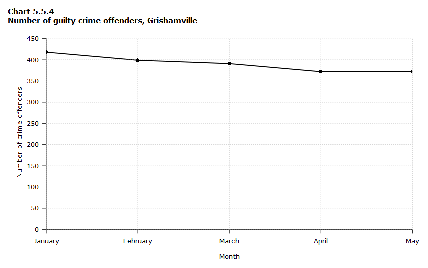
Data table for Chart 5.5.4
| Month | Number of crime offenders |
|---|---|
| January | 418 |
| February | 399 |
| March | 391 |
| April | 372 |
| May | 372 |
Using a scale of 350 to 430 (Chart 5.5.3) focuses on a small range of values. It does not accurately depict the trend in guilty crime offenders between January and May since it exaggerates that trend. However, choosing a scale of 0 to 450 (Chart 5.5.4) better displays how small the decline in the number of guilty crime offenders really was.
Both charts can be useful depending on the context. The important thing to remember is that you should pay attention to the scale that is being used when interpreting a graph.
Example 4 – Multiple line graphs
A multiple line chart can effectively compare similar items over the same period of time, as you can see in Chart 5.5.5 which compares the use of cell phones by gender.
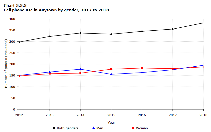
Data table for Chart 5.5.5
| Year | Number of men (thousands) | Number of women (thousands) | Total number (thousands) |
|---|---|---|---|
| 2012 | 150.0 | 147.5 | 297.5 |
| 2013 | 165.0 | 157.5 | 322.5 |
| 2014 | 177.5 | 160.0 | 337.5 |
| 2015 | 155.0 | 177.5 | 332.5 |
| 2016 | 162.5 | 182.5 | 345.0 |
| 2017 | 175.0 | 180.0 | 355.0 |
| 2018 | 195.0 | 187.5 | 382.5 |
Chart 5.5.5 is an example of a good chart. The message is clearly stated in the title, and each of the line graphs is properly labelled. It is easy to see from this chart that the total cell phone use has been rising steadily since 2012, except for a one-year period (2015) where the numbers drop slightly. The pattern of use for women and men seems to be quite similar with very small discrepancies between them.
- Date modified: