
5 Data Visualization
5.4 Pie chart
Text begins
A pie chart, sometimes called a circle chart, is a way of summarizing a set of nominal data or displaying the different values of a given variable (e.g. percentage distribution). This type of chart is a circle divided into a series of segments. Each segment represents a particular category. The area of each segment is the same proportion of a circle as the category is of the total data set.
Pie chart usually shows the component parts of a whole. Sometimes you will see a segment of the drawing separated from the rest of the pie in order to emphasize an important piece of information. This is called an exploded pie chart. Chart 5.4.1 is an example of an exploded pie chart.
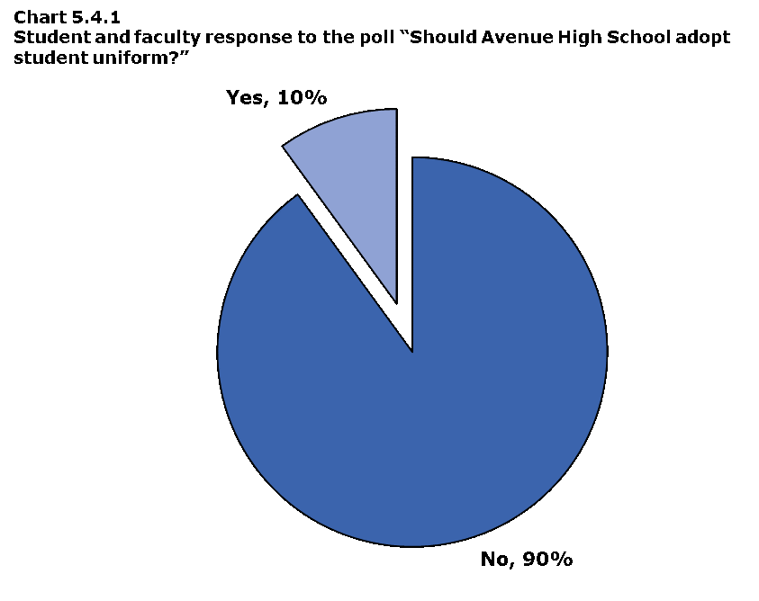
Data table for Chart 5.4.1
| Response | Percentage (%) |
|---|---|
| Yes | 10 |
| No | 90 |
The pie chart above clearly shows that 90% of all students and faculty members at Avenue High School do not want to have a uniform dress code and that only 10% of the school population would like to have one. This point is clearly emphasized by its visual separation from the rest of the pie.
The use of the pie charts is quite popular, as the circle provides a visual concept of the whole (100%). Pie charts are also one of the most commonly used charts because they are simple to use. Despite its popularity, pie charts should be used sparingly for two reasons. First, they are best used for displaying statistical information when there are no more than six components only—otherwise, the resulting picture will be too complex to understand. Second, pie charts are not useful when the values of each component are too similar because it is difficult to see the differences between slice sizes.
A pie chart uses percentages to compare information. Percentages are used because they are the easiest way to represent a whole. The whole is equal to 100%. For example, if you spend 7 hours at school and 55 minutes of that time is spent eating lunch, then 13.1% of your school day was spent eating lunch. To present this in a pie chart, you would need to find out how many degrees represent 13.1%. This calculation is done by developing the equation:
percent ÷ 100 × 360 degrees = the number of degrees
This ratio works because the total percent of the pie chart represents 100% and there are 360 degrees in a circle. Therefore 47.1 degrees of the circle (13.1%) represents the time spent eating lunch.
Constructing a pie chart
A pie chart is constructed by converting the share of each component into a percentage of 360 degrees. In Chart 5.4.2, music preferences in 14- to 19-year-olds are clearly shown.
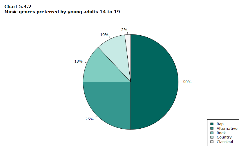
Data table for Chart 5.4.2
| Music genre | Percentage (%) |
|---|---|
| Rap | 50 |
| Alternative | 25 |
| Rock | 13 |
| Country | 10 |
| Classical | 2 |
The pie chart quickly tells you that
- half of students like rap best (50%), and
- the remaining students prefer alternative (25%), rock and roll (13%), country (10%) and classical (2%).
Tip! When drawing a pie chart, ensure that the segments are ordered by size (largest to smallest) and in a clockwise direction.
In order to reproduce this pie chart, follow this step-by-step approach:
If 50% of the students liked rap, then 50% of the whole circle graph (360 degrees) would equal 180 degrees.
- Draw a circle with your protractor.
- Starting from the 12 o’clock position on the circle, measure an angle of 180 degrees with your protractor. The rap component should make up half of your circle. Mark this radius off with your ruler.
- Repeat the process for each remaining music category, drawing in the radius according to its percentage of 360 degrees. The final category need not be measured as its radius is already in position.
Labelling the segments with percentage values often makes it easier to tell quickly which segment is bigger. If there are few categories, the percentage and the category label should be indicated beside their corresponding segments like in Chart 5.4.3. This way, users do not have to constantly look back at the legend in order to identify what category each colour represents.
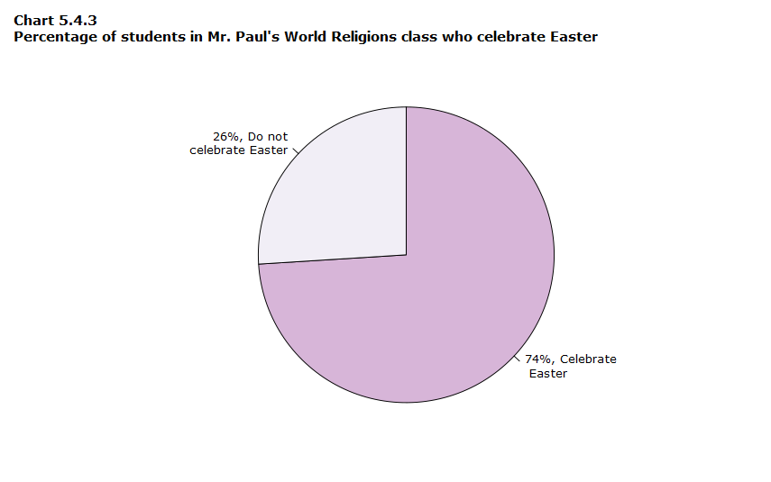
Data table for Chart 5.4.3
| Celebrate Easter | Percentage (%) |
|---|---|
| Yes | 74 |
| No | 26 |
The pie chart above conveys a clear message to the user—that 74% of all students in the World Religions class celebrate Easter. We can easily tell what the message is by simply looking at the accompanying percentages.
It is more difficult to understand the message behind Chart 5.4.4 because there are no percentage figures given for each slice of the pie. The user can still develop a picture of what is being said about the type of pets sold by this store, but the message is not as clear as it would have been had the parts of the pie been labelled.
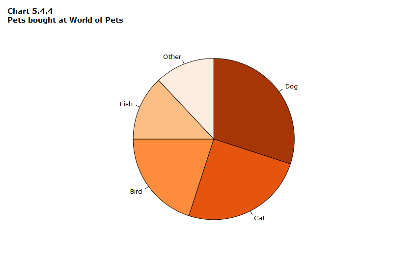
Data table for Chart 5.4.4
The pie chart shows the proportions for the categories: dog, cat, bird, fish and other. However, the proportions are not indicated in the labels so it’s not possible to know precisely what the proportions are.
In the Chart 5.4.5 below, the legend is formatted properly and the percentages are included for each of the pie segments. However, there are too many items in the pie chart to quickly give a clear picture of the distribution of movie genres. If there are more than five or six categories, consider using another type of graph to display the information. Chart 5.4.5 would certainly be easier to read as a bar chart.
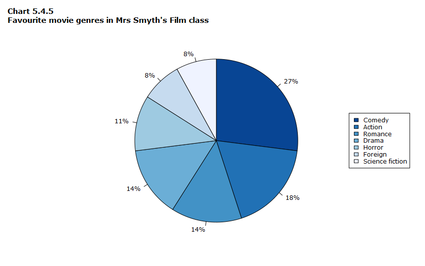
Data table for Chart 5.4.5
| Movie genres | Percentage of students (%) |
|---|---|
| Comedy | 27 |
| Action | 18 |
| Romance | 14 |
| Drama | 14 |
| Horror | 11 |
| Foreign | 8 |
| Science fiction | 8 |
Tip! Many software, like spreadsheets, will draw pie charts for you quickly and easily. However, research has shown that many people can make mistakes when trying to compare pie chart values. In general, bar charts communicate the same message with less chance for misunderstanding.
Pie charts versus bar charts
When displaying statistical information, refrain from using more than one pie chart for each figure. Chart 5.4.6 shows two pie charts side-by-side, where a grouped bar chart would have shown the information more clearly. A user might find it difficult to compare a segment from one pie chart to the corresponding segment of the other pie chart. However, in a grouped bar chart, these segments become bars which are lined up side by side, making it much easier to make comparisons.
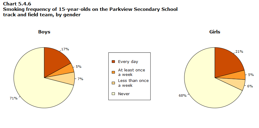
Data table for Chart 5.4.6
| Smoking frequency | Percentage of boys (%) | Percentage of girls (%) |
|---|---|---|
| Every day | 17 | 21 |
| At least once a week | 5 | 5 |
| Less than once a week | 7 | 6 |
| Never | 71 | 68 |
Chart 5.4.7 shows how a grouped bar chart would be a better choice for displaying information than a double pie chart. The key point in preparing this type of graph is to ensure that you are using the same scale for both categories of the bar chart. You’ll notice that the information is much clearer in Chart 5.4.7 than in Chart 5.4.6.
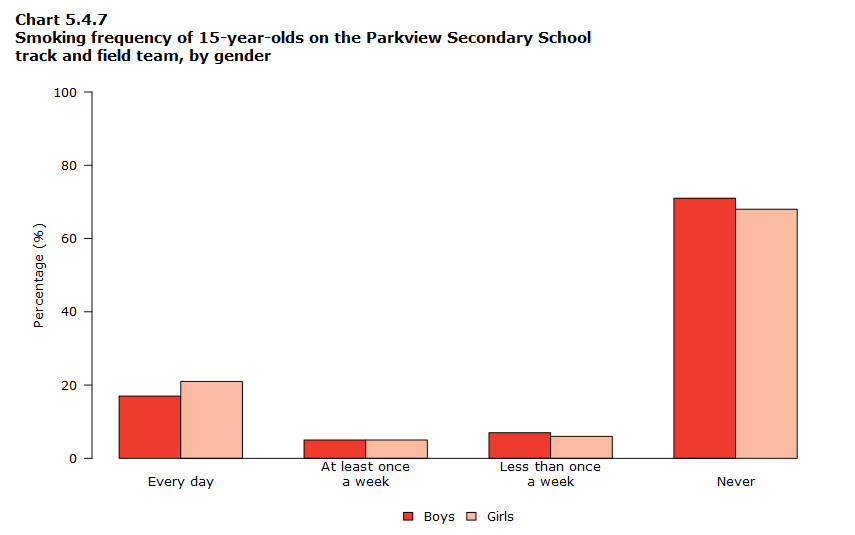
Data table for Chart 5.4.7
| Smoking frequency | Percentage of boys (%) | Percentage of girls (%) |
|---|---|---|
| Every day | 17 | 21 |
| At least once a week | 5 | 5 |
| Less than once a week | 7 | 6 |
| Never | 71 | 68 |
- Date modified: