
5 Data Visualization
5.6 Scatter plot
Text begins
In science, the scatterplot is widely used to present measurements of two or more related variables. It is particularly useful when the values of the variables of the y-axis are thought to be dependent upon the values of the variable of the x-axis.
In a scatterplot, the data points are plotted but not joined. The resulting pattern indicates the type and strength of the relationship between two or more variables. Chart 5.6.1 is an example of a scatterplot. Car ownership increases as the household income increases, showing that there is a positive relationship between these two variables.
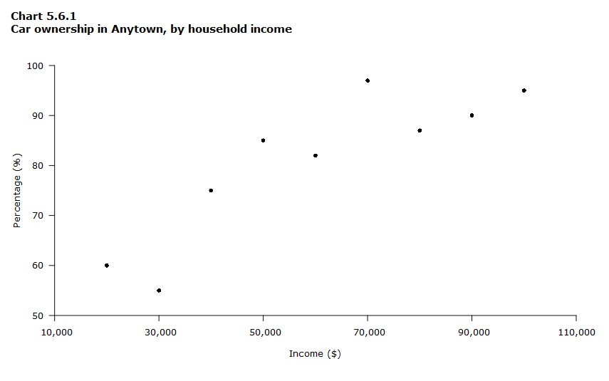
Data table for Chart 5.6.1
| Income ($) | Percentage (%) |
|---|---|
| 20,000 | 60 |
| 30,000 | 55 |
| 40,000 | 75 |
| 50,000 | 85 |
| 60,000 | 82 |
| 70,000 | 97 |
| 80,000 | 87 |
| 90,000 | 90 |
| 100,000 | 95 |
The pattern of the data points on the scatterplot reveals the relationship between the variables. Scatterplots can illustrate various patterns and relationships, such as:
- a linear or non-linear relationship,
- a positive (direct) or negative (inverse) relationship,
- the concentration or spread of data points,
- the presence of outliers.
Linear or non-linear relationship
When the data points form a straight line on the graph, the relationship between the variables is linear, as shown in Chart 5.6.2, Part A. When the data points don’t form a line or when they form a line that is not straight, like in Chart 5.6.2, Part B, the relationships between variables is not linear.
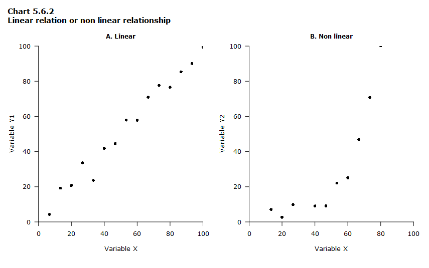
Data table for Chart 5.6.2
| Variable X | Variable Y1 (Part A) | Variable Y2 (Part B) |
|---|---|---|
| 0 | -3 | -2 |
| 7 | 4 | -2 |
| 13 | 19 | 7 |
| 20 | 21 | 3 |
| 27 | 34 | 10 |
| 33 | 24 | -5 |
| 40 | 42 | 9 |
| 47 | 45 | 9 |
| 53 | 58 | 22 |
| 60 | 58 | 25 |
| 67 | 71 | 47 |
| 73 | 78 | 71 |
| 80 | 77 | 100 |
| 87 | 85 | 160 |
| 93 | 90 | 249 |
| 100 | 99 | 392 |
| 0 true zero or a value rounded to zero | ||
Positive or negative relationship
If the points cluster around a line that runs from the lower left to upper right of the graph area, then the relationship between the two variables is said to be positive or direct (Chart 5.6.3, Part A). If the points cluster around a line that runs from the upper left to the lower right of the graph area, then the relationship is said to be negative or inverse (Chart 5.6.3, Part B).
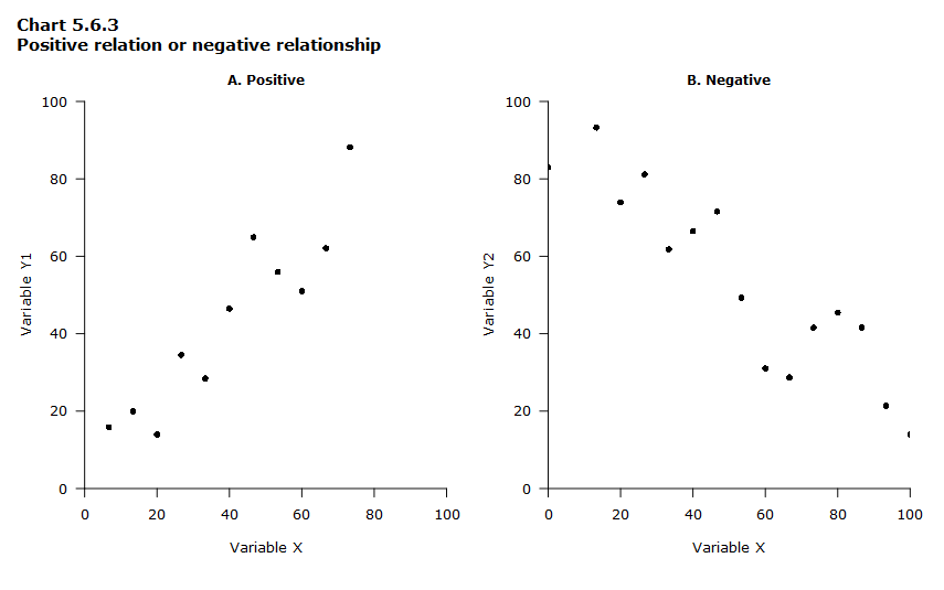
Data table for Chart 5.6.3
| Variable X | Variable Y1 (Part A) | Variable Y2 (Part B) |
|---|---|---|
| 0 | -17 | 83 |
| 7 | 16 | 103 |
| 13 | 20 | 93 |
| 20 | 14 | 74 |
| 27 | 35 | 81 |
| 33 | 28 | 62 |
| 40 | 46 | 66 |
| 47 | 65 | 72 |
| 53 | 56 | 49 |
| 60 | 51 | 31 |
| 67 | 62 | 29 |
| 73 | 88 | 42 |
| 80 | 105 | 45 |
| 87 | 115 | 42 |
| 93 | 108 | 21 |
| 100 | 114 | 14 |
| 0 true zero or a value rounded to zero | ||
Concentration or spread of data points
Data points can be close together (Chart 5.6.4, Part A) or spread widely across the graph area (Chart 5.6.4, Part B).
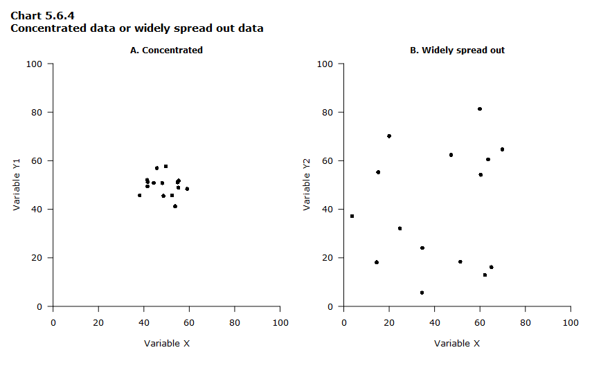
Data table for Chart 5.6.4
| Variable X1 (Part A) | Variable Y1 (Part A) | Variable X2 (Part B) | Variable Y2 (Part B) |
|---|---|---|---|
| 44 | 51 | 4 | 37 |
| 42 | 51 | 25 | 32 |
| 48 | 51 | 64 | 60 |
| 49 | 46 | 15 | 18 |
| 38 | 46 | 51 | 18 |
| 41 | 52 | 60 | 54 |
| 55 | 51 | 20 | 70 |
| 50 | 58 | 35 | 24 |
| 54 | 41 | 15 | 55 |
| 59 | 48 | 47 | 62 |
| 42 | 49 | 62 | 13 |
| 55 | 49 | 35 | 6 |
| 52 | 46 | 60 | 81 |
| 46 | 57 | 65 | 16 |
| 55 | 52 | 70 | 65 |
Presence of outliers
Besides portraying relationships between the variables, a scatterplot can also show whether or not there are any outliers in the data. Outliers are data points that are far from the other points in the data set, like the two points in red in Chart 5.6.5.
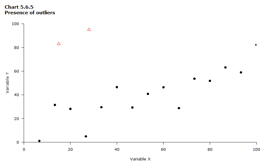
Data table for Chart 5.6.5
| Variable X | Variable Y | Symbol |
|---|---|---|
| 0 | -1 | Black circle |
| 7 | 1 | Black circle |
| 13 | 32 | Black circle |
| 15 | 83 | Red triangle (potential outlier) |
| 20 | 28 | Black circle |
| 27 | 5 | Black circle |
| 28 | 95 | Red triangle (potential outlier) |
| 33 | 30 | Black circle |
| 40 | 46 | Black circle |
| 47 | 29 | Black circle |
| 53 | 41 | Black circle |
| 60 | 46 | Black circle |
| 67 | 29 | Black circle |
| 73 | 54 | Black circle |
| 80 | 52 | Black circle |
| 87 | 63 | Black circle |
| 93 | 59 | Black circle |
| 100 | 82 | Black circle |
| 0 true zero or a value rounded to zero | ||
- Date modified: